You are using an out of date browser. It may not display this or other websites correctly.
You should upgrade or use an alternative browser.
You should upgrade or use an alternative browser.
Creativity Needed
- Thread starter tomanorth
- Start date
Welcome to the forums! Hope you enjoy your stay!
I removed your PDF attachment, nobody in their right mind should download a file, PDFs included, from a forum. It's not that we don't trust you, we don't trust strangers - stranger danger!
You can use the forums tools to include images in your posts for critique -

Option 1 - drag an image

Options 2 - click the paper clip icon to insert via a URL.

Thanks
I removed your PDF attachment, nobody in their right mind should download a file, PDFs included, from a forum. It's not that we don't trust you, we don't trust strangers - stranger danger!
You can use the forums tools to include images in your posts for critique -

Option 1 - drag an image

Options 2 - click the paper clip icon to insert via a URL.

Thanks
On the logo - it looks very much like this one, well the frame does.
I haven't looked for the bird - but if I did, would I find it on an image stock website?
You really have to be careful with things like this - not that it wasn't done completely by accident - it happens, and it's a basic shape.
But the bird is not a basic shape.
I'd think about the copyright that is already existing for the elements of your logo with the bird. You don't want to end up in a hot mess.

In regards to the layout - it's good.
I'd push Raw to the next line to Raw Honey is on the same line.
I haven't looked for the bird - but if I did, would I find it on an image stock website?
You really have to be careful with things like this - not that it wasn't done completely by accident - it happens, and it's a basic shape.
But the bird is not a basic shape.
I'd think about the copyright that is already existing for the elements of your logo with the bird. You don't want to end up in a hot mess.

In regards to the layout - it's good.
I'd push Raw to the next line to Raw Honey is on the same line.
scotty
Ultimate Member
Wrote this as your post got edited.
I had to Google "Limoncello" as I didn't know what it was.
After that I searched I then Googled "Limoncello label" and they all look very similar with a botanic style illustration of some lemons and leaves.
Edit. Just seen you're label.
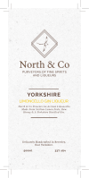
I don't see anything much wrong with it as it stands although it does look a little tall for a bottle label but then I don't know what bottle it's going on.
It's understated and reserved but that in itself is a look.
I guess a lot depends on the message you're trying to get across with the branding for your demographic.
Who will buy it?
A common trend is to ge with a very traditional, strong typographical approach and same with any images/illustration.
Victorian etching/engraving style that fit the Yorkshire feel but is that what you're going for?
My friend makes flavoured liqueurs in Derbyshire but his branding isn't Derbyshire focused.
If I were you I'd think either going for a traditional Italian look or the more local craft distillery vibe which is dare I say it....is a bit Hipster.
Thanks for the advice matey, copyright barely even crossed my mind!On the logo - it looks very much like this one, well the frame does.
I haven't looked for the bird - but if I did, would I find it on an image stock website?
You really have to be careful with things like this - not that it wasn't done completely by accident - it happens, and it's a basic shape.
But the bird is not a basic shape.
I'd think about the copyright that is already existing for the elements of your logo with the bird. You don't want to end up in a hot mess.
View attachment 6869
In regards to the layout - it's good.
I'd push Raw to the next line to Raw Honey is on the same line.
I think you're right with trying to fit it into the yorkshire style! The bottles I am using are pretty long hence the length of the label.Wrote this as your post got edited.
I had to Google "Limoncello" as I didn't know what it was.
After that I searched I then Googled "Limoncello label" and they all look very similar with a botanic style illustration of some lemons and leaves.
Edit. Just seen you're label.
I don't see anything much wrong with it as it stands although it does look a little tall for a bottle label but then I don't know what bottle it's going on.
It's understated and reserved but that in itself is a look.
I guess a lot depends on the message you're trying to get across with the branding for your demographic.
Who will buy it?
A common trend is to ge with a very traditional, strong typographical approach and same with any images/illustration.
Victorian etching/engraving style that fit the Yorkshire feel but is that what you're going for?
My friend makes flavoured liqueurs in Derbyshire but his branding isn't Derbyshire focused.
If I were you I'd think either going for a traditional Italian look or the more local craft distillery vibe which is dare I say it....is a bit Hipster.
Do you have any advice as to how to get a botanic style illustration of leaves and lemons? I'm guessing I'd have to approach somebody to design one?
Cheers!
Thanks for the advice matey, copyright barely even crossed my mind!
Don't forget to push the Raw onto the same line so it's Raw Honey all on one line
Hope the copyright stuff didn't offend, it's just something I do with all logos, see where they came from. Most are stolen logos from other people's work, which is why I do it - or they have taken elements from stock logos and used them, which is an infringement on the T&Cs of most stock image sites.
No offence taken what so ever! I appreciate the advice.Don't forget to push the Raw onto the same line so it's Raw Honey all on one line
Hope the copyright stuff didn't offend, it's just something I do with all logos, see where they came from. Most are stolen logos from other people's work, which is why I do it - or they have taken elements from stock logos and used them, which is an infringement on the T&Cs of most stock image sites.
I really like the label - maybe it's because I like Gin and and I like lemon!
Can't really go wrong.
Clean readable, easily identifiable, I checked several other gin type labels and lemon type labels and didn't find anything too similar.
Overall, good, clean, professional looking label.
You can always print off the label yourself and cut it out and stick it on the bottle (or similar bottle) to get a sense if it's the right shape etc.
Have you got pics of the bottle?
scotty
Ultimate Member
I think you're right with trying to fit it into the yorkshire style! The bottles I am using are pretty long hence the length of the label.
Do you have any advice as to how to get a botanic style illustration of leaves and lemons? I'm guessing I'd have to approach somebody to design one?
Cheers!
I thought that was the case with the shape of the bottle so good call there.
If you're not a Designer by trade then well done on the design.
Regarding the Illustrations, I've just been elsewhere discussing the very same topic.
It was about using old Victorian illustrations and copyright as being so old, they don't have the same issues with rights but I can't find it now.
You could always use a stock image site like Shutterstock where you can get images fairly reasonably but you'd need to check if you needed the extended license with it being a product.
One issue with using stock is that it's not unique to you and if you do go on to make other products keeping continuity of the branding.
That being said, botanic illustrations tend to have a very similar look to them.
Another option would be to commission an Illustrator to do them.
If this is one of your first products then this is the time to address your branding.
Look at how others have done it like True North in my home town of Sheffield.
I really like the label - maybe it's because I like Gin and and I like lemon!
Can't really go wrong.
Clean readable, easily identifiable, I checked several other gin type labels and lemon type labels and didn't find anything too similar.
Overall, good, clean, professional looking label.
You can always print off the label yourself and cut it out and stick it on the bottle (or similar bottle) to get a sense if it's the right shape etc.
Have you got pics of the bottle?
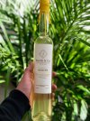
I did a prototype the other afternoon but still feel the yellow is lost within the colour of the spirit. I have thought about using a printing company that can add a gloss to the font to make it shine in the light!
Hmmm.

scotty
Ultimate Member
I did a prototype the other afternoon but still feel the yellow is lost within the colour of the spirit.
You could always try having the yellow text on a black solid or the other way around but it doesn't look to bad on the proto.
I think a metallic ink - or even gold/yellow foil would look better.
This is as close as a I can find.
It would add a bit more expense to the finished label. Your printer should be able to quote you and show you samples.

This is as close as a I can find.
It would add a bit more expense to the finished label. Your printer should be able to quote you and show you samples.

Wardy
Well-Known Member
It's ok, but it certainly won't scream at you on the shelf. The North logo and name dominates too much and the yellow on white is just too subtle.
I agree about using some engraving style illustrations, it needn't cost you a fortune to commission an illustration or two and you would have something unique to yourself.
Something like a bee on a lemon would look cool maybe.
I agree about using some engraving style illustrations, it needn't cost you a fortune to commission an illustration or two and you would have something unique to yourself.
Something like a bee on a lemon would look cool maybe.
Paul Murray
Ultimate Member
I expected much worse from a DIY jobby 
The only thing I'd suggest is the spacing in Y O R K S H I R E is a bit uneven, I tihnk you need to manually adjust the Y O R to make it look even.
The only thing I'd suggest is the spacing in Y O R K S H I R E is a bit uneven, I tihnk you need to manually adjust the Y O R to make it look even.
AysheaS
Member
It's simple and clean - which is nice. I did something similar for a practise project and I looked at etched style illustration but in the end I used dots rather than lines. It was for traditional made fizzy drinks, including Traditional Lemonade - the majority of the background was yellow for that one. Maybe something to consider? Because I agree that the yellow does get lost a bit. Or maybe increase the text size for the flavour? Or maybe gold foil as hankscorpio suggested.
