You are using an out of date browser. It may not display this or other websites correctly.
You should upgrade or use an alternative browser.
You should upgrade or use an alternative browser.
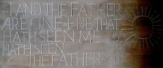
Coventry Cathedral typeface
- Thread starter jayartibee
- Start date
- Status
- Not open for further replies.
Kev Clarke
Member
I take it you have searched through sites like dafont.com?
jayartibee
New Member
I take it you have searched through sites like dafont.com?
Yes I've looked at dafont - mind you it could be hiding there with a funny name...
spottypenguin
Active Member
It's pretty close to Peignot
PEIGNOT-LIGHT-Thin - Download Font Free! All Fonts Are Free to Download
PEIGNOT-LIGHT-Thin - Download Font Free! All Fonts Are Free to Download
jayartibee
New Member
It's pretty close to Peignot
I'm afraid I think Ralph Beyer would shudder in his grave to think of that. I adore the stone tablets at Coventry as much as I consider Peignot to be a very unpleasant typeface.
Sorry to be blunt - but that terrible Peignot mixture of upper and lower case has always struck me as deeply horrid.
But don't be offended - and thanks for looking.
spottypenguin
Active Member
I wasn't suggesting it as a substitute, however given there are some similar shaped letters you may be able to manipulate it to suit.
jayartibee
New Member
vincent007
Member
This font also looks like Fox TRF ExtraLight
Post from 2012 - CLOSED
- Status
- Not open for further replies.

