Millionsknives
New Member
Hi everyone,
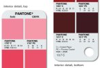
What the best way to pick colours when starting a project and be sure that print out as you envisioned & hoped? Is picking colours from Pantone swatches and using the CMYK process colour values the safest way? I notice the Pantone swatches have Printing Notes, but it's all far too complex for me - are these industry standard?
I recently graduated from University and was never taught any of this and have no one I can ask in person. I know l'll never get an exact replica of colours, but what's the best way to go? I ask because on my printer at home (which is admittedly not great) prints the colours a lot more washed out than the Pantone swatches would suggest (closer to how my screen, which is calibrated, displays the colour). I'm trying to get my portfolio finished and want to nail the colours down as much as possible before I spend money on printing!
I'd really appreciate any insight into how you chose colours at the start of a project. It's holding me back at the moment,
Thank you.
