Advice/Critique on Composer Portfolio

VonHorsebeard

New Member
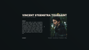
Hi! I'm currently designing my own portfolio site from scratch (very new to this) and would love to get some feedback on the design! (Typography, Layout, anything)
Currently I'm sketching all of this in photoshop, actually getting it to work and flow nicely online would be the next step.
I like the idea of creating a simplistic, straight ahead one-page static design in which you can toggle between 2 (or 3) pages displaying a bio, portfolio work and perhaps contact info.
I'm relatively new to this field but eager to learn! Any critique is welcome!
Grts.
 

Attachments

  • site v1.6.3.png
    site v1.6.3.png
    447.6 KB · Views: 6
What do you want the site to achieve? Assuming it's to generate leads then you need to show people what you do, provide evidence of your skills and most importantly display a means to get in contact. At this point you (the person) don't matter. Nobody cares about you, all they care about is discovering if you can meet their needs.

And the site needs to work on a desktop, tablet and phone.

I wouldn't bother with photoshop. Start with a structured HTML/CSS layout and get your content written. After that all you need to do is fiddle with the CSS to make it look the way you want.

Top Tip: white on black isn't a good combination. The highest converting layout is a dark largish font on a white background.
 
Thanks for your reply!
The foremost goal of my site is indeed to be a means of contact with clients and quickly showcasing skills/work.
Your point on meeting needs is indeed a true one. Should I get rid of the bio completely and swap it with a description describing skills (being the thing you see first as you enter the site), or should I compactly blend the two in 1 slide?
The mobile/tablet layout are indeed in the back of my mind, I wanted to focus on them after finishing sketching the desktop version.
My reason for using photoshop first is because of my lack of knowledge of HTML, sketching things out was a bit easier there for me, but sure, I can switch environments!

I don't think I fully understand why white on black is a bad thing? Would you care to elaborate?

Thanks again.
 
Potential clients/employers will only ever be on your site because they want what you do. So the first thing you need to display on the homepage is examples of your work. Nothing wrong with having your bio on the site but leave it on a different page so people can link to it if the want to find out more.

You don't need to use photoshop. You can easily install something like wordpress and build the site. Once the site is complete all you need to do is switch the theme to one you like. There are thousands to choose from.

White on black is very tiring to read. The brain has to work harder to process the images as they aren't in a recognised format (eg: black on white). People will be less inclined to stay on the site.
 
Back
Top