Please critique my fitness website

madphi

New Member
A few months ago we started a website where we talk with serious fitness people, i.e. bodybuilders, personal trainers and so on.

The site is Bulk Hackers, https://www.bulkhackers.com/

Several people have emailed us and said the site is great stuff with lots of useful information, but there are also people who says the site looks a bit scammy.

i.e. that the site looks like a "get a sixpack in 5 minutes" website instead of a site with serious and useful information.

That's a bit sad, so I'm hoping some of you might critique the site and share how it can be improved.

Thanks!
 
Take the name "hackers" out of it.

Bulk Guru or something a bit more engaging!

The word "hacker" in the site name triggered our spam filters and I had to approve the post.
 
Take the name "hackers" out of it.

Bulk Guru or something a bit more engaging!

The word "hacker" in the site name triggered our spam filters and I had to approve the post.

Good point. But we are already being shared in the fitness world, so can't change the name/domain.
 
You can change the name and keep the "bulkhackers" site - but have it redirect to "bulkguru"

Redirects should be easy to setup.

And a name change would take a few months or even a year to trickle through.

It's not impossible to do.
 
You can change the name and keep the "bulkhackers" site - but have it redirect to "bulkguru"

Redirects should be easy to setup.

And a name change would take a few months or even a year to trickle through.

It's not impossible to do.

Agree. Not impossible.

What about the site itself, especially in relation to making it not look like a scam/get rich scheme?
 
I don't get that feel from it.

It's a bit too rigid in the formation of topics.

Actually the structure of the page doesn't show me any topics - just a list of people and I don't know why I'd pick one over the other.


There's 6 pages - but you don't know that until you get to the bottom - plus - I don't want to scroll through six pages.


Basically, your landing page has no Call To Action. What do you want your clients/potential clients to do when they get there?
My initial thought is you want me to look at personal profiles. But why?

Clicking on BodyBuilders is great - I get to see all the bodybuilders - and likewise for the rest of the categories.


But there's no point on any of the pages where you engage with the person landing on the page to a Call to Action.

What is the purpose of your site - what do you want the client(s) to do when they get there - why should they care about reading an interview (and indepth one at that!)?


What would I do to change the home page?


I'd have the categories laid out on the home page as clickable or searchable icons (kinda like your Groups Page)
Read InDepth interviews
Then the icons/badges for each category.


Your About page has hidden Call to Action Gems
GET FEATURED
SOCIAL MEDIA FEEDS


This should all be on your main home page - in an engaging well laid out and thoughtful presentation.
 
That's the most useful feedback I have seen in a long time! Respect and thanks (y)

Great idea moving the groups to the frontpage + adding clear call to actions.

Purpose of the site is to make people read the interviews, so the readers learn something + the people we interview get a bigger audience, potential clients, etc.
 
Hard to say after you planted the seed ;)

I'd not really thought until I read Hank's comment but the word "hacker" could be a negative.

I don't think it comes across as scammy by looking at it but I think it's because people have come to expect that from fitness sites where they drew the comparison?

Maybe give a little more emphasis to what you're doing "In-depth Interviews with the Best in Fitness"?
 
I didn't have a lot of time - so didn't do a great job - but basically - something like this.

At least when I come to the site, 1) I know what you do. 2) I can access the interviews I want to read about, 3) I might want to get featured (plus builds up a nice email database for data driven marketing), 4) Social media is at the front.

It's not a great job - but just a quick 5 minute go - as I have to leave to go pick up my dog.


Screen Shot 2020-01-02 at 16.42.21.jpg
 
Honest first impressions...
I had no idea what your site 'sells', I didn't even see the 'In-depth Interviews with the Best in Fitness' in the header image until a few minutes later, a point where most users will have decided to leave or stay already.

In terms of content, it basically feels more like a blog but the layout doesn't really suit that sort of vibe, it does kind of come across as one of those sites where it's 'get fit in six weeks' and for me I think the reason is that it's the amount of content on the front page, there's no 'most recent' article(s), they're all just lumped in a 'gallery' format.

It does need more 'calls to action' even for things like getting people to click on other subsections, in their current position they're a bit lost. If it was me I'd move them down under the 'title image' and make them a bit more prominent. I'd also question some of the terms given to sections, when I went to 'groups' I was expecting a forum or a directory type of thing, not just another index of what's on your site.

If I was changing it I would add in more information about the aim of the site, maybe even add a proper home page with most recent articles, bolder links to the sub topics etc. This same home page can make things more evident like social media and contacting you, I didn't even know they were available until I clicked on the about page...

In terms of overall aesthetics, it just seems a little flat, it's lacking any character and as much as I like minimalist design, I'd argue it's too minimal. I will say I like the lack of adverts, that always gets a thumbs up from me, if you do decide to do adverts on the site, maybe consider sponsored content rather than 'ads' on the page :) Just a side note type of thing about the design, I'm using a 16:9 1080p display and honestly it felt incredibly narrow and felt like something was missing on the page due to the relatively huge borders, so it might be worth looking at your page layout or how scales on wider screens, especially considering there will be some out there with 21:9 or 4k displays (doesn't seem to scale with screen res) now.

As to the term hackers, I'm neither here nor there on it, I know that hackers have a negative connotation in certain environments but I'm also used to hearing the term hacks as a way to say 'speed this up' or in game design where dev hacks are used while testing.
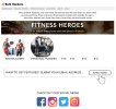
 
I don't think it comes across as scammy by looking at it but I think it's because people have come to expect that from fitness sites where they drew the comparison?

Maybe give a little more emphasis to what you're doing "In-depth Interviews with the Best in Fitness"?

Guess you are right there. There's a lot of scamming going on in fitness, so people have their shields up when they see the site.

Maybe we can improve the trust by adding some testimonial quotes to the frontpage (we got a few emails from people praising the site, i.e. saying is super useful and motivating etc.)
 
I didn't have a lot of time - so didn't do a great job - but basically - something like this.

At least when I come to the site, 1) I know what you do. 2) I can access the interviews I want to read about, 3) I might want to get featured (plus builds up a nice email database for data driven marketing), 4) Social media is at the front.

It's not a great job - but just a quick 5 minute go - as I have to leave to go pick up my dog.


View attachment 7235

That's awesome! Thanks.
 
Just a side note type of thing about the design, I'm using a 16:9 1080p display and honestly it felt incredibly narrow and felt like something was missing on the page due to the relatively huge borders, so it might be worth looking at your page layout or how scales on wider screens, especially considering there will be some out there with 21:9 or 4k displays (doesn't seem to scale with screen res) now.

I'm on a 2560p screen and I can see your point. Noted. Thanks.

As to the term hackers, I'm neither here nor there on it, I know that hackers have a negative connotation in certain environments but I'm also used to hearing the term hacks as a way to say 'speed this up' or in game design where dev hacks are used while testing.

Very true, I think of hacking as finding an easier/faster way, but I guess many people think of it as a negative word. Crossing my fingers that will change just like nerd is no longer a negative word.[/QUOTE]
 
What's the purpose of the website?

I'm not a bodybuilder so not sure if this what other body builders like to read - but it does feel very narcissistic.

I suspect most people will be reading at the interviews on their phones. So look at the site on your phone.

I also agree it looks spammy. The titles of the interviews make it so.

The actual interviews aren't. They are just answers to a set of stock questions - there is no interview or exploration of the topic.

Are they really the 'Best in Fitness'?

On a technical side, your hosting isn't the best and if your CSS was optimised you wouldn't need compression. And not sure why you are using the flatsome theme, it's overly complex for your very simple site.
 
Good points. Thanks.

How did you determine that the hosting have an issue? (it might have, it's a Dreamhost VPS)
 
Run a speed test on the site. They all show a long TTFB:

The key question is still: what is the purpose of the site? Who are you targetting and for what purpose? If it's just so bodybuiders can show off then it's fine. If it's for any other purpose I can't see it.
 
Run a speed test on the site. They all show a long TTFB:

Thanks. I'll look into it.

The key question is still: what is the purpose of the site? Who are you targetting and for what purpose? If it's just so bodybuiders can show off then it's fine. If it's for any other purpose I can't see it.

The plan is to make a site that will inspire/motivate people to get more fit + share advice for improving your training/recovery/diet, etc. (I'm quite fit myself, but I have definitely learned a lot from the interviews myself).
 
Getting fit =/= Bodybuilding

People looking for fitness advice and motivation will use a range of websites and SM platforms, their needs will be very different to those being interviewed.

You need to be offering diet and lifestyle advice. Suggestions about simple fitness techniques, things you can do outside a gym.

There are thousands of fitness blogs and similar. Getting a yours noticed outside the bodybuilding world will be very difficult.
 
The images don't load for me, so that's not good.

I think you header image could look better/more professional.

Generally I think the design could be a bit more refined to look more professional.

I would also up the font size of the blog posts, finding it a bit hard to read.

And I agree with everyone that the purpose of the website is not entirely clear. When I land on it, I sort of think "ok, now what? how does this help me?". Some introductory text would probably help with that, like you included in the About page.

These are my first impressions. Hope it helps!
 
Back
Top