WIP - Hand lettering practice

Athos

Active Member
Hi guy's long time no see!

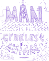
I'm actually working on my first hand lettering project. I am more and more interested about the subject so after a few videos on skill share i've started this little project and naturally i'm here to find some advices and comments to help me improve this piece.

I choose the quote : " Man is the cruelest animal "

After some researches I decided to create something around oil plateformes and his impact onto ocean environnement.

Here is my final sketch :
img042.png

what about the composition? Do you have some advices around inking? Thanks a lot!

See ya!
 
Hey Athos, welcome back! :D
Where you been?

Hand lettering....COOL!

I think the most important things with had lettering are composition, legibility and having fun doing it.
I think your composition is working although the "A" seems to pull over to the left and the ocean dips to the right.
Also my eye is drawn to the cloud on the upper right.
Everything else seems to be pretty symmetrical apart from that.
Maybe add some sun rays behind the "MAN" which could also serve as your lighting point?
A kind or rear lit feel could look quite dramatic.
Kind of the sunset on the day of man.
Just to add a bit of story to it.
Sorry, waffling on now.

Loving the layout and idea though.

For stuff like this I find a layout pad is invaluable as you can work over a design a few times and really refine it and experiment.
Using some light construction lines help to keep things in check.

Once you're happy with that then I'd just have some fun with the inking.
Try dome different techniques like cross hatching or stippling (which is very "in").
Pinterest has a lot of this kind of thing on there so I find it a great reference.

If you go digital then a faux blackboard feel could be cool.

Looking forward to seeing where you go with this.
 
Looking ok, but you're a little way off inking yet. Like Scotty says, get a piece of tracing or something and start refining it a bit.
Lose some of the waves, straighten up MAN, put proper curves on ANIMAL, etc. Might look nice in a circle?
Cruellest looks odd to me with one L, a bit Americanised?
 
Hey thanks guy's!!!

I will take every of your comments under consideration. For this one I would like to ink it in a traditional way but for the color part it will be digital(i think). At the end I want in term of mood....something dark, I don't know how to explain exactly... Night sky but using red palette for a part of drama and on the top of the "A" you have a burning flame so I think it will help to lead you eyes to the right place.

But yes first of all i'm gonna work more onto my sketch (using a kind of grid probably).

Cruellest with a double "L" sure? Maybe! You know...I'm french so :p but after some research on internet they give me cruelest with only one "L". Both work probably?!
 
The only observation I can make is it maybe feels a little bit cramped towards the bottom? The fish bones don't look too boney either, but I'm really clutching at straws. I think this is one of those pieces that will work once it's coloured.
 
Back
Top