You are using an out of date browser. It may not display this or other websites correctly.
You should upgrade or use an alternative browser.
You should upgrade or use an alternative browser.
Which one do you prefer?
- Thread starter Nelsonbroddy
- Start date


- Status
- Not open for further replies.
Paul Murray
Ultimate Member
Bottom, with tweaks.
Maarten de Haas
New Member
I like the first one better, but it's difficult/expensive for using in print, so I would adjust the shape of the first one to make it more suitable for printing
vincent007
Member
I like here first one, because of whales design goes with the logo.
KPrinceArt
Member
Honestly I like the first one better, but only if you get rid of the gradients, and maybe the outline too. You can make it different shades, if that makes sense.
Ink Corporate
New Member
Majority wins! #1 is The better logo design
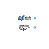
Hey guys,
I've recently designed a logo
Actually two logos!
Now i don't know which one is better(according to the name of website whale+paper)...
Which one do you prefer? Why? And how can I make them better?
Which did you go with and how did it turn out in the end?
miriam.guimel
New Member
These logos are both nice, I would go with the second one. Or if you get rid of that gradient from the first one, it would look better
asififtekhar
New Member
Both logos are looking fine. But the whale isn't really much identifiable. If you can fix that then 2nd logo will be a great choice.
Polytheist
Member
I like the skeuomorphism of the first one and deign style of the second one. means i would apply a gradient to the second one.
petermartinez
New Member
I personally prefer the second one.
- Status
- Not open for further replies.