You are using an out of date browser. It may not display this or other websites correctly.
You should upgrade or use an alternative browser.
You should upgrade or use an alternative browser.
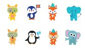
Which characters do you prefer?
- Thread starter wonky
- Start date
Bottom row, I presume that's your re-draw?
Ok well bottom row is much more polished and child friendly.
I am for bottom ones.
Paul Murray
Ultimate Member
Maybe it's the eyes but I do like the informal stroke on there as well.
I like a bit of both, the eyes on the top but the overall style of the bottom (though I don't really like the elephant for some reason. It depends on the context they'll be used in I suppose.
Paul Murray
Ultimate Member
'We like them both, can you do a combination of the two styles?'
And this is why I only ever present one logo idea to a client!
wonky
New Member
Thanks for all your comments. The top row are the original characters (there are 12 in total) and the bottom are my "updated" versions. They're used on a wide range of things, colouring in sheets, posters, stationary etc. but there are potential plans to further develop them.
My thinking behind the changes were:
1) The original colours were a touch garish at times
2) I wasn't keen on the standard illustrator brushstroke that was used everywhere
3) The eyes and mouths felt quite flat and lifeless
4) A lot of the characters had gradients (cheeks) which looked a bit dated
I was basically trying to make them look a bit more timeless, rather than the original look which i felt would age quite quickly.
I was quite surprised about the comments prefering the original eyes though - was that just because you weren't keen on the bottom eyes, rather than liking the plain circles?
thanks again, it was really helpful!
scotty
Ultimate Member
I was basically trying to make them look a bit more timeless, rather than the original look which i felt would age quite quickly.
I was quite surprised about the comments prefering the original eyes though - was that just because you weren't keen on the bottom eyes, rather than liking the plain circles?
I don't mind the lower eyes at all.
They do remind me of Southpark characters though.
The thing with character design of this sort is building in an emotional connection that the viewer gets from the off.
This is the hard bit.
As base images I like the top set better as they look more endearing to me.
A little like what Meomi do with theirs.
They may seem to have less expression than the lower but that comes when you start to pose them out and it's much quicker and easier to work with as well, especially if you don't do this kind of thing all the time.
With the lower set you'll need to build an expression set that would need to be more extensive and difficult than the top. (K.I.S.S rule).
If you use the same eyes across the board then they risk looking a bit odd and the circles are a lot more adaptable but that's up to you.
I do get what you're saying about making them look more timeless but I think the upper set achieve this better personally.
Please don't get me as being over critical or a bit funny.
I've built lots of character sets like this before and one had almost every animal you could think of with about 20 different poses/expressions each so I learned from my own mistakes.
(K.I.S.S rule). again.
Once you start dropping them into scenes and posing them you'll see what I'm getting at.
You may have already built them this way but it helps to make them in a modular way.
As if you were going to animate them with arms, body, legs, head, face, ears and stuff all separate.
It makes them much easier to work with later on.
