What's wrong with this logo?

A few more revisions:

3asIV.jpg


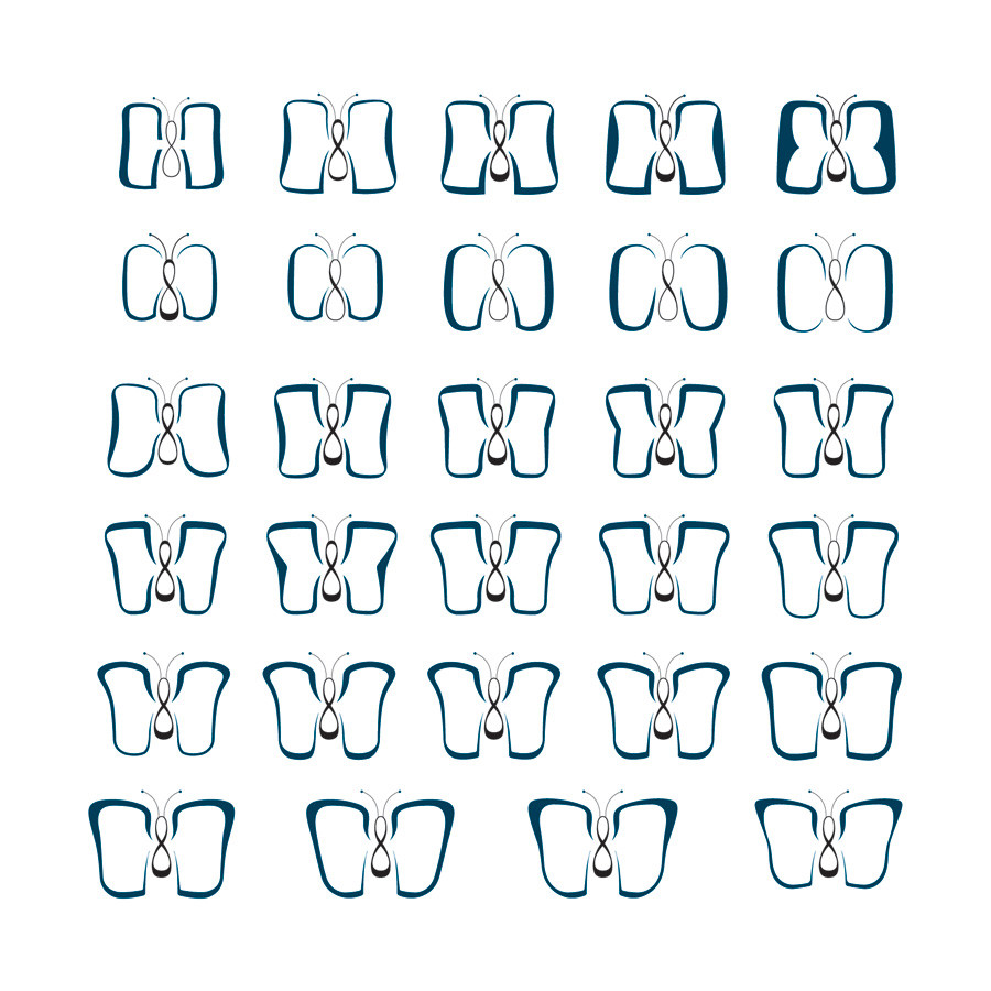
I'm currently leaning towards the third one on the bottom row. I think it looks most like a butterfly while also getting across the C&D and also having that all important pinch in the wings, albeit a subtle pinch. I've also made the body a little lighter towards the top and heavier on the bottom to give a bit more balance.

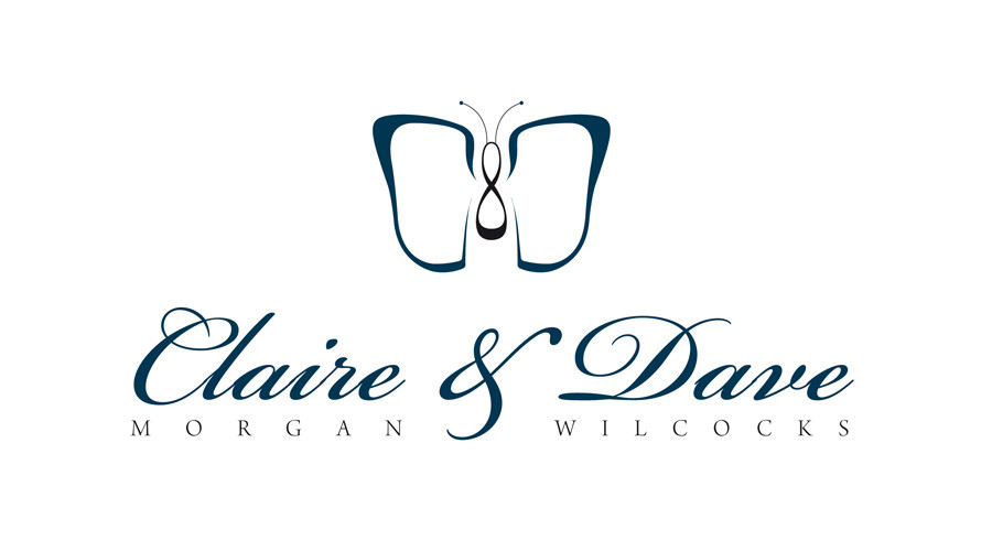
And here's how the third logo on the bottom row looks with the text:

SSmb1.jpg
 
Shouldn't butterflies be symmetrical? If so the C and the D will never work as a C can never really be a D. The latest version looks the best but maybe if you still feel it ain't working you could just add little Cs and Ds on the wings to make a symmetrical pattern like butterflies have.
marquesan-butterfly.jpg
 
I think number 4 on the bottom row looks like a butterfly, but it doesn't look enough like a C and a D to me. I think the third one is the best of both worlds.

As for the body, my original idea was that it was primarily an ampersand, but, perhaps more fittingly, in its current form, it also represents the infinity symbol i.e. Claire and Dave forever.

Ally, I think you could argue that the currently butterfly is symmetrical, albeit only vertically. As Levi pointed out, butterflies wings are bigger on top so a horizontally symmetrical set of wings wouldn't look right anyway. I like the idea of producing something like the graphic you linked to, but at this stage, it wouldn't be a good idea to go back to the drawing board as this project needs to move onwards.
 
Just going off on a random thought for a minute so tell me to shhh if u want,but do we need to be looking at the butterfly square on? Would it work better if the c was small and the d was large,(or vice versa) giving the butterfly some perspective as if it has turned away slightly to fly off? It might help make the wings look more like the letters they represent and would give u a few more options to play with?

Just a thought.
________
Da buddah vaporizers
 
I think the one on the bottom right corner is more delicate that the one you've chosen. Does the body of the butterfly need to be that dark? maybe lightening it would make the whole logo and names work better together?
 
davewill said:
Just going off on a random thought for a minute so tell me to shhh if u want,but do we need to be looking at the butterfly square on?

Dave, shhh. :p

Definitely not going back to the drawing board for angular butterflies at this stage, but it's certainly something I didn't think of.

aizerr, I actually agree that it's more delicate, but I don't think it communicates the letters as well as the third on the bottom row. Remember that the aim is not only to make it look like a butterfly, but also to communicate a C and a D.

I showed the bride and groom the invitations earlier and they are very, very happy with what I've done so far thankfully! They said they're impressed. As I mentioned in my initial post, this is much more than a logo, but a very special and unique three-piece wedding invitation that includes a poem (chosen by them), a wedding invitation and an RSVP. As the design is not finalised yet, I'll hold off on uploading the artwork but once it's been printed, I'll give it a quick mention. :)

Thanks for your help, guys and girls. Always appreciated.
 
Back
Top