What's everyone working on?

View attachment 1604

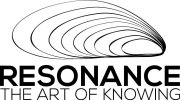
so this is the logo, I've been working on with my client. They spent 5 hours with me yesterday and i think it's turned out pretty good, It needs some tweaking on the typography.

The concept is about something 'resonating' with you, the client in question is a business coach and we discussed many many concepts of how she wanted to represent herself and the black hole idea / drawing was a key element as people generally believe a black hole leads to nowhere, but in fact that is not true. The hole itself is the beginning of something that eventually comes back to itself after a time. It's really conceptual and this is how my client explained it to me, anyways i'll explain it more at a later date when all the other work is finished.

But the client is happy and so am :D
 

Attachments

  • logo.jpg
    logo.jpg
    47.7 KB · Views: 2
maybe it's me (blame physics lessons) but that 'conceptual image' is more symbolic of an aircraft hitting a sound barrier, well to me at least. Having said that the client is happy and it is conceptual so all's good.
 
Levi said:
maybe it's me (blame physics lessons) but that 'conceptual image' is more symbolic of an aircraft hitting a sound barrier, well to me at least. Having said that the client is happy and it is conceptual so all's good.
Funny you should mention physics as it's partly based around that and the sound thing aswell. As far as concepts go this is totally up for personal interpretation.
 
I can't tell you why, because I don't know, there's just something odd/off about this logo for me...! Maybe because it's all black and there's no variation... As long as the client is happy. :)

Spent today working out a new marketing strategy for a popular WooCommerce plugin. I'm also being paid (pretty well) to do an hour a day of their support tickets, to get a better understanding of what their customers want - it's actually pretty fun.
 
Currently working on map that's going to go on a flyer, to help customers find my clients location. Wondering how to best indicate local landmarks/points of interest within the visual style...
yteoihQ.png
 
Sean Lee-Amies said:
Currently working on map that's going to go on a flyer, to help customers find my clients location. Wondering how to best indicate local landmarks/points of interest within the visual style...
what type of landmarks....
 
tesco - shopping trolley
school - children
church - cross/spire/graveyard

Simple iconography or you could maybe do a sort of 3d effect of the building.
 
Unfortunately they haven't paid enough for custom icons :(
 
I'm just going to be sticking with brand elements: + / x / o (comprised of a dashed line)

I'll give you an update in a little while, gotta prepare for the launch of a new networking event I'm helping to run soon though, so can't spend too much longer on it.
 
Today had a kid off sick with food poisoning so been on bucket duty.

This evening got a gig to design the publicity for a one off Run DMC/Labyrinth concert.

What a silly, silly day :( :)
 
Most of the day today will be spent on cartoon backgrounds and UI bits and bobs. Part of the day may be spent sketching volcanoes. Some of the day will be all about building up an illustration around a baby fairy princess character. None of it will be spent chasing up money from a client I will never work with again.

And later I'll be making the Hairy Dieters version of Cordon Bleu.
 
I should be doing some invoicing but I can't be arsed.

Instead I've got to visualise a spaceman toasting a marshmallow on the sun.

Not got a clue what it's for but hey. :)
 
scotty said:
So, in a round about way you're saying that you actually can polish a turd then?
Perhaps if it was casted in bronze, but otherwise why would you polish it? it would just smear everywhere.
 
Back
Top