What are your thoughts on this book cover design?

MuchAdoDesign

New Member
Hi everyone

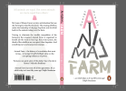
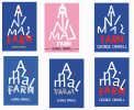
I'm a graphic design student (final year!) and need a bit of feedback on a project. I've entered the Penguin competition and the book cover is Animal Farm.

The brief is to bring the cover up to date to appeal to a contemporary audience.

If you could give me feedback on if you think the design communicates a sense of hierarchy, the bottom layers struggling to support the small few at the top and if it is technically and professionally up to scratch, that would be great. I'm also wondering if the typography for the author's name should be looked at more.

Also, any final touches I should look at making?

Appreciate it.

Thanks
Stef
 

Attachments

  • Screen Shot 2018-09-17 at 17.39.30.png
    Screen Shot 2018-09-17 at 17.39.30.png
    212.7 KB · Views: 31
It's not bad - a bit anemic. It's quite dated looking
I've seen that type of lettering for that book before, reversing the letters etc.

Have you come up with anything else?
 
I did the exact same book for a college project, a long time ago!

I think the concept is ok but the typography needs working on a bit. The letters are a bit too spindly and not too legible (did you try lower case?) for me and I'm not keen on the
grey on white. Did you try it with a coloured background which letters white out? The author's name looks stuck on because you ran out of room,
needs to be a lot more prominent at the bottom. Farm can be smaller or more compressed. The quote could maybe go at the side (and should say 70 years now?).
I would also stick a pig's tail on the A.
 
It took me a while to read the name at first but overall I like it. What's the rationale for the typography on the front? And what's the negative space shape in the counter of the A supposed to be, I can't make it out?

I'd look at the typography of the quotes on the back, I think they'd benefit from being differentiated from the actual blurb a little, either through a smaller font or just a lighter shade.
 
Thanks all, I do really appreciate your feedback.

I have had a few ideas but this one seems the strongest. I have developed it slightly in order to incorporate the America theme - to communicate that America/Trump is headed the same way. I'm attaching a few other ideas, so any further help would be great. Also, I have tried it with small case lettering and I like it. I think the star on the i is a nice way of communicating that America is 'breaking'. (Whether you agree or not is not an issue!).

In response, the triangular shape the lettering is in is symbolic of the triangle of power, with the few being at the top and the many below them, supporting them. They are being pushed to their limits and I've tried to show them breaking, which in turn will make the top fall eventually.

I've been told by my tutor I should stay away from 'pig' references as it's been overdone, so the pink was to imply the pig theme without drawing a pig! Also, the negative space in the A was meant to be a pig trotter print, but can see this hasn't been successful!

Thanks

Stef
 

Attachments

  • Screen Shot 2018-09-17 at 14.35.09.png
    Screen Shot 2018-09-17 at 14.35.09.png
    73.2 KB · Views: 11
  • Screen Shot 2018-09-19 at 08.32.32.png
    Screen Shot 2018-09-19 at 08.32.32.png
    272.9 KB · Views: 12
I like the red star, very reminiscent of Communism. And the Trump hair is a nice idea, but I'd probably save that for another project. Animal Farm is a metaphor for post-WW2 Russia and a critique of Communism. I don't think the themes covered in the book apply in the same way to modern-day/future America. There's certainly similarities, abuse of power and such like, but ultimately it's about Communism, not Capitalism and I'd stick to that theme.
 
I agree with Paul, I don't really get the Trump reference.

I think a couple of the others are going in the right direction (I still think a tiny pig's tail would be nice!). The main title I think would look better hand-drawn and try some more muted colours (red would be the obvious one to try),
this is one I like:

Book.jpg
 
Thanks Paul. I was guided slightly by my tutor there as it may help to appeal to the contemporary market.

Honestly I actually think using Trump is a pretty obvious and dare I say unoriginal idea. It's probably been done a million times already, but then again, so has the 'Communist propaganda approach', so I think you could argue both cases.

If you want it to appeal to a contemporary (younger) audience, then I suppose it makes sense to relate it to current world events, but somehow using Trump just feels a bit too easy for me.
 
Thanks both! Strangely, Trump hasn't been done before in this context, which surprised me. But there could be a reason for that of course!

Right, I'll get back to work :)

Stef
 
Ideas of design book cover is really nice, actually you designed the font in a really nice way which is looks like anime type. This triangle shape is really nice.
 
Back
Top