You are using an out of date browser. It may not display this or other websites correctly.
You should upgrade or use an alternative browser.
You should upgrade or use an alternative browser.
What am I missing?
- Thread starter edgar101084
- Start date
edgar101084
New Member
edgar101084
New Member
scotty
Ultimate Member
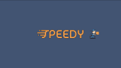
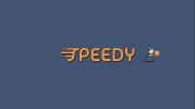
To me, I did read "SPEEDY" but after the seed was sewn then I can't un-see "PEEDY" now.
I'm actually liking the concept with the speed lines on the S but maybe to make it all read together then you could try making the PEEDY look a little more in line with the S?
The S appears to be kind of italicised and leaning or moving forward so maybe by doing the same with the rest may make it read properly.
Also, I see that the S has rounded ends where as the rest are square like a 'but cap' line.
Joey3537
New Member
Woah! Not bad at all. I love the little character! Did you make him?
Personally, I like the S concept. It communicates the message the logo stands for. However, Scotty does make a good point. You should stay consistent with your font style. Also, I would bring in the charter a little closer to the font, as I feel like there's too much empty space.
Excellent choice of the colors by the way!


