typography poster

prings

Junior Member
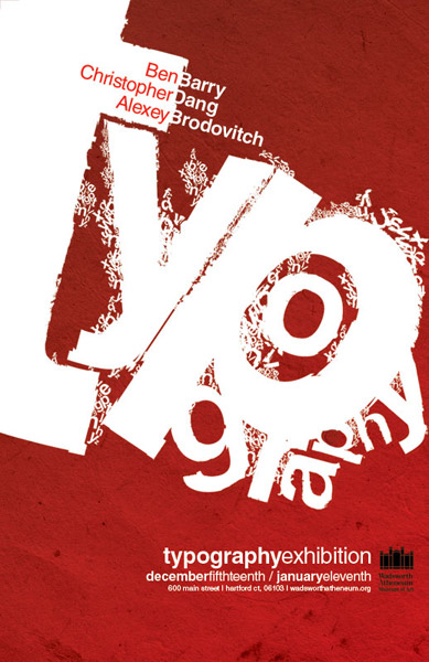
A last minute project last semester, we were told to make a poster 11x17 for an art exhibition at a local museum. The poster style had to reflect the art at the exhibition. We could choose any style we wanted and any 3 designers. None of the designers have much to do with typography (besides Alexey Brodovitch) I just chose designers whos work I find very inspirational. All feedback and critique welcome

3524507676_c373f13604_o.jpg
 
my only thing I would change, and thats just a personal thing.. I would change the colour for the first names in the white to being black instead of red.. but other than that :) very nice :)
 
Looks great! Really good work. But I also think it would look better with Black text instead of Red. And it would tie in nicely with the little black logo in the bottom right.
 
Xenonsoft said:
Black or a darker red that fits more into the colour scheme, that red doesn't seem right to me.

I thought the same Fred, but I'm guessing it is the same red, just at that thickness it looks like a lighter/brighter red.
 
Probably one of the lighter reds on show, either a highlight in the texture or further down the poster? I'd grab a midtone/darker red from the Bg and use that :up:

Good point about the weight though, definitely plays tricks on the eyes.

Only other thing regarding that bit of text is that it doesn't seem to quite line up with the white surnames, although that might just be my eyes again.
 
I wonder if we will see a revised version with the text in a different colour? :)
 
thanks guys, all really good suggestions. I'm pretty obsessed right now with working on my first ambigram, but ill def. make some updates to this.
 
I love the use of texture you've got going on! The usage of contrasting bold text is really awesome to. I gotta say, I can't really add any critique. It looks great.
 
Back
Top