Hi,
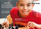
I have created a trifold brochure about chess lessons for kids. It is 11 x 8 1/2. I think the image on the front might be overwhelming the text but I like the photo (thought of blurring the face of the boy but the background is already blurred). Having issues with where and how to layout text and how to make the brochure more appealing. I think the main audience is parents so it doesn't how to look to child like in design but I am stuck. Can't thing of any design ideas and googling online and on Pinterest isn't giving me any ideas. Thanks in advance.
I have created a trifold brochure about chess lessons for kids. It is 11 x 8 1/2. I think the image on the front might be overwhelming the text but I like the photo (thought of blurring the face of the boy but the background is already blurred). Having issues with where and how to layout text and how to make the brochure more appealing. I think the main audience is parents so it doesn't how to look to child like in design but I am stuck. Can't thing of any design ideas and googling online and on Pinterest isn't giving me any ideas. Thanks in advance.