You are using an out of date browser. It may not display this or other websites correctly.
You should upgrade or use an alternative browser.
You should upgrade or use an alternative browser.
Thoughts on personal logo?
- Thread starter Siked
- Start date


lukedavies
Member
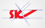
I'd probably cut the top of the 'K' at the same angle it's been cut for the extending line on the far right. Looks to be around 45 degrees? I'd then line it up with the white space you have between the 'k' and the extending line ")
S
Squiddy
Guest
It's not a bad logo, however, I feel the font you've used/characters you've designed don't look right. For example the width at the top of the S is wider than the two centre points of the curves for the top part of the S.
As for it looking similar to the Sky logo, I wouldn't worry about that because the designs aren't similar enough that it looks like it's been copied, so there's no legal issue and I personally can see the originality in the design. I didn't think of sky whatsoever until Levi brought up the issue.
Well done though, considering you're only 15 this is very good. I've seen work from much older "professionals" that's a lot worse. It's refreshing to see someone who's new to this that doesn't apply drop shadows, glows, inner glows, horribly clashing colours etc
I think to improve it you're going to have to sort the font/characters out and do something more with the brush. I'm going to assume that SK are your initials and that it isn't meant to read ski.
yellowdog
Member
I quite like this, a good strong logo. I would just tidy up some of the lines that you've got going on, something Squiddy has mentioned.
I've attached an image that should get across what I mean.
For 15, your doing damn well! When I was 15 I was too busy completing 'Ecco the Dolphin' on Mega Drive to care about anything else.
I've attached an image that should get across what I mean.
For 15, your doing damn well! When I was 15 I was too busy completing 'Ecco the Dolphin' on Mega Drive to care about anything else.
Attachments
DubaiWebDesign
Junior Member
at the age of 15 great man great ur logo is superb keep it up

Thewholehogg
Active Member
Coolio
GibbonsGraphics
Junior Member
Hey Mate, nice logo, this is wierd. I am from West Sussex too
I am 14. Strange Huh :L I agree about smotthing out the inner curves of the s.
Good Luck
Ben
I am 14. Strange Huh :L I agree about smotthing out the inner curves of the s.
Good Luck
Ben
GilmoreVisuals
Active Member
I don't think the angles of the S work well- maybe try and make the in the same angle as the K and the diagonal line?
I can't see the sky logo there at all though, so I wouldn't worry about it.
Really? This is suposed to look like Simons logo? Nah, I don't think so at all...

I can't see the sky logo there at all though, so I wouldn't worry about it.
Really? This is suposed to look like Simons logo? Nah, I don't think so at all...