DavoSmith
Member
Discussed this one with Tony before but its moved on a fair bit since so thought I'd put it on seen as I got some good feedback on the Physio stuff.
Client originally wanted me to spend a day modernising their typographic logo, which we did, improving spacing and adding a little additional originality the name element as they were looking for an identity to use as a lone symbol also, going forward. Anyway, they agreed it had modernsied, but still felt unhappy I guess with the original fundamentals of theur identity and wanted me to put a bunch of time in to a look at rebranding with something more organic that lead their brand away from appearing too Architect and more on the landscaping side of life. Which is right really.
So thats where were at with it, and they like where its got to, and I'm just waiting on feedback for the latest revisions. Interested tohear anyones thoughts really, not that they have anymore time budgeted for the logo element, but we can see. I'm looking forward to looking more at the identity as a whole now.
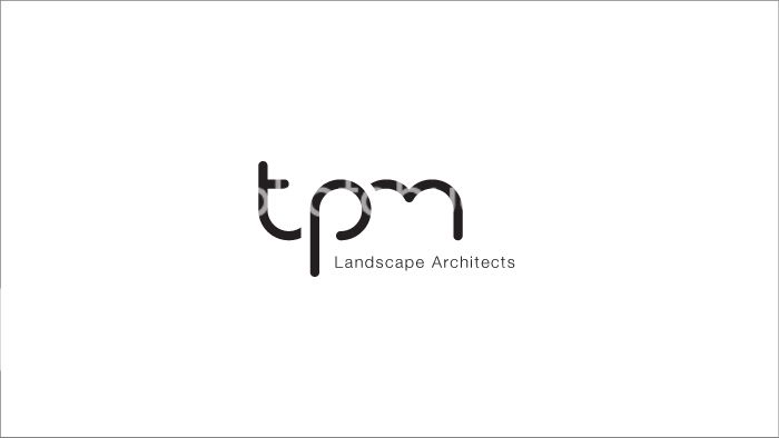
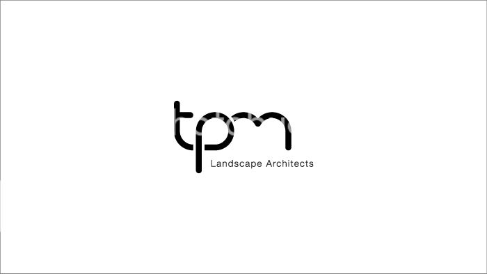
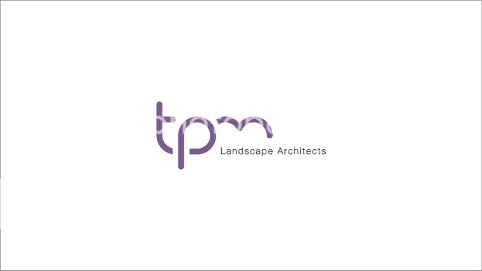
Here is a snapshot of the progress.
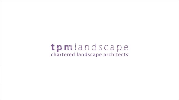
ORIGINAL / EXISTING:
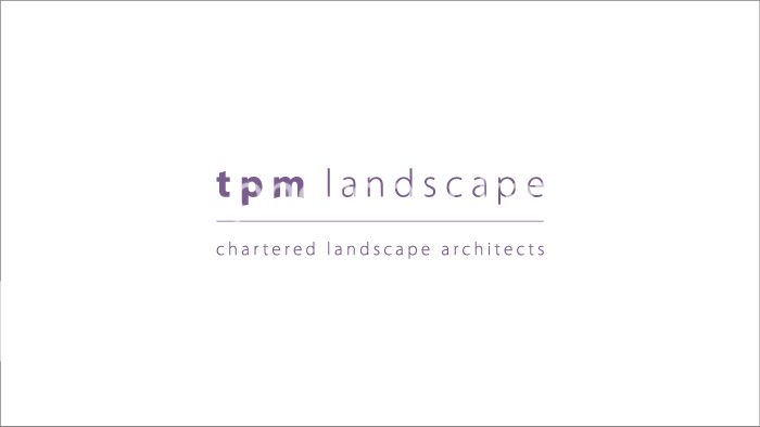
MODERISED:
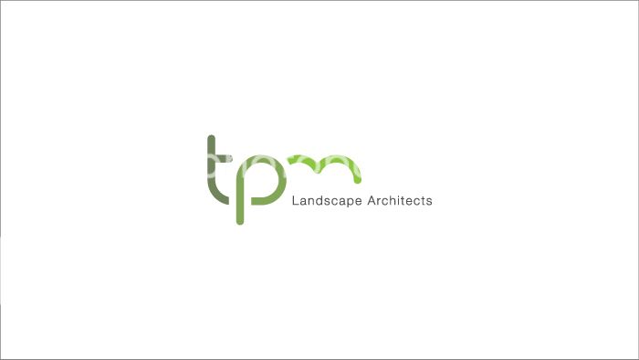
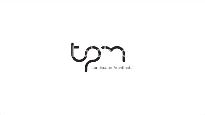
MORE ORGANIC REBRAND:
http://s267.photobucket.com/user/TheMacMagician/media/LandT_DevShow_06.jpg.html]
 [/URL]
Client originally wanted me to spend a day modernising their typographic logo, which we did, improving spacing and adding a little additional originality the name element as they were looking for an identity to use as a lone symbol also, going forward. Anyway, they agreed it had modernsied, but still felt unhappy I guess with the original fundamentals of theur identity and wanted me to put a bunch of time in to a look at rebranding with something more organic that lead their brand away from appearing too Architect and more on the landscaping side of life. Which is right really.
So thats where were at with it, and they like where its got to, and I'm just waiting on feedback for the latest revisions. Interested tohear anyones thoughts really, not that they have anymore time budgeted for the logo element, but we can see. I'm looking forward to looking more at the identity as a whole now.
Here is a snapshot of the progress.
ORIGINAL / EXISTING:
MODERISED:
MORE ORGANIC REBRAND:
http://s267.photobucket.com/user/TheMacMagician/media/LandT_DevShow_06.jpg.html]