

This is a brief to brand the City of London or "The City" as its known as.
I want to create something that is to be used by The City to highlight the positive changes The City is making in regards to transparency etc. The project is also to promote the city square mile to businesses and other countries. I also want it to highlight the positive things The City does for the country in terms of generating wealth, the UK is heavily reliant on The City and it makes up a big part of UK GDP.
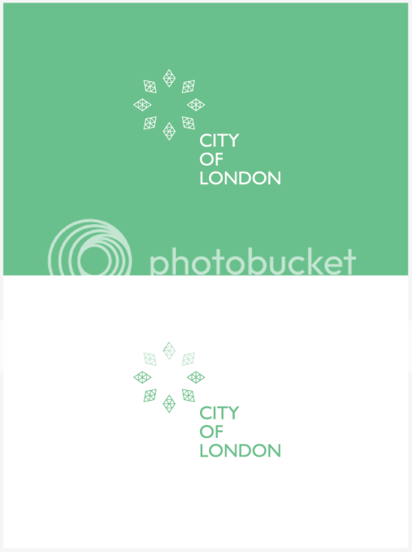
So to summarize I want the logo to reflect growth and the distribution of wealth, I have also taken inspiration from some of The City's most recognizable architecture (The Gherkin mainly). I think the triangular pattern works in terms of the stock market side of things also. The shapes are pointing outwards, reflecting the distribution of wealth and also I have tried to implement the element of growth.
Bare in mind the brief states this is not meant to compete or anything with the City of London coat of arms, and is not to be used by the city itself but the banks and businesses inside the square mile.
I want to create something that is to be used by The City to highlight the positive changes The City is making in regards to transparency etc. The project is also to promote the city square mile to businesses and other countries. I also want it to highlight the positive things The City does for the country in terms of generating wealth, the UK is heavily reliant on The City and it makes up a big part of UK GDP.
So to summarize I want the logo to reflect growth and the distribution of wealth, I have also taken inspiration from some of The City's most recognizable architecture (The Gherkin mainly). I think the triangular pattern works in terms of the stock market side of things also. The shapes are pointing outwards, reflecting the distribution of wealth and also I have tried to implement the element of growth.
Bare in mind the brief states this is not meant to compete or anything with the City of London coat of arms, and is not to be used by the city itself but the banks and businesses inside the square mile.