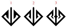
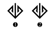
Tech Consultant Logo

Which logo concept resembles the letters J and b?


  • Total voters
    2

jbenjamin

New Member
Hi. It's supposed to say JB, but more like Jb. Tell me your first thoughts on these initial concepts. Tell me what you love and hate and spare no feelings here. What feelings and ideas does it convey? I like the symmetry here - i want it to be mirrored like that. I also want it to convey tech and be easy to remember and recognize.

I need it to be a Jb, so anything that may resemble a JL, or JC, JG, GG- when the end of the characters finish in a hook shape, or a fonty look, this seems to pull off the Jb.

I love the simplicity of I, G, E,C,D,A

H, F, and B looks suspect- penishish. and now that i have it in my brain, i can't stop seeing them.

I like the fonty feel of B, C, and A- Shaping those letters more and not having them so boxy brings out the letters

What are your thoughts?
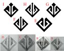
lkjlkj.jpg
 
None of the above. If you hadn't said they were supposed to represent letters I'd never had guessed.

They don't represent tech, they look like some sort of clan logo.

Why do feel you even need a logo? Would it not be simpler to just use your name, it's far more memorable.
 
I would have thought 'db' if you hadn't have said, which I have seen many times shown like this (which tends to look like a dick with bollox!)
 
@fisicx clan is good. @Stationery Direct I think a capital J and lowercase b is definitely legible in a few of them. Particularly in F

to me the renditions looked a lot like circuitry. it reminded me of circuits and it just felt techy. I had another post on another forum and threw that feedback in. Thanks so much for the feedback guys. ICA werent chosen, nor were they even legible to me. F definately had something. It was simple with a little flare to it and I wanted to continue on with that. D is underated but totally simple at the top. a clean path at the top- so i used that for round 2.

Round 2....jb25.jpg

and Round 3...

jbr2.jpg

And my final design...

jb_logo.png

it could definitely be a d and a b. it could be played off as abstract. can you see a j and a b? is it a stretch?
 
Nope still can't see a JB. I get what you are trying to do but it's just not working. You are forcing a symmetrical design onto two things that aren't a mirror image of each other.

Still didn't answer my question, why do you think you need a logo?
 
I think if you want it to read as "jb" you need to abandon the idea of it being perfectly symmetrical. If the left hand shape cut off in line with the point of the square and the right hand one joined up completely it would be much clearer, whilst still being somewhat abstract.
 
@fisicx I just like the idea of having a logo. I'd hate to get into that here though. Look for my thread on, hey do you think i need a logo?

I value all the opinions guys. you have held me off a day or two at least from sending this to print. lol. I will decide and come to terms, but i have to do it slowly. Sometimes we become attached to the shitty ideas that no one else can see. I'm still in the phase where I think you're all fools, but this will pass in a few years. There's def a d or a j and a b or a 6 lol. It could work, but i have to decide how it feels. I mean, my whole problem with this is the b is lowercase.
 
I'm assuming you will have the name of the business next to the logo (and a tagline below). If this is the case it doesn't really matter what you use, so pick anyone you like. If the logo is to be used in isolation it needs to be much more obvious. People rarely remember the details in a logo, they just recall the general structure. For example the starbucks logo is a green circle with something in the middle - that's enough to recognise it from a distance. The fine detail is irrelevant. So your logo need to be the same - something someone will recognise at a glance. And it doesn't do that, all I recall is a diamond in a diamond - no letters just the shape and nothing really memorable.
 
Back
Top