Tall Resumes

Polytheist

Member
I am planning to design a creative resume. The picture below displays two different layout style of making a resume.
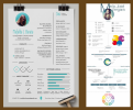
6984

The left-side shows an example of very common layout style while the resume on the right-side exhibits my fav style, similar to my website's template.
As you know, many company managers or even clients use a device like cellphone to view your resume. The problem is, if your resume is too tall, your visitor will be forced to zoom in on your resume to read or the fonts/elements will look TOO small. any idea?
 
A resume for what or whom?

While pretty, neither tell me anything useful. If I wanted a graphic designer all I really want to see is examples of your work. I don’t care about anything else.

And neither are good examples of an effective UX.
 
Give us a chance.. it is the weekend...

Personally I prefer a simple a4 layout for a resume. Both the designs you've done look cluttered and are hard to read imo.

It's all very well following 'online trends', which is basically what you've done here, but online trends don't necessarily translate onto physical media.
 
As you know, many company managers or even clients use a device like cellphone to view your resume.
Nobody I know that hires for creative positions would be checking CVs on a phone. A large majority of employers will also ask for a standard A4 Word version for HR to keep on record, so whilst you can spend a great deal of time designing a nice looking CV, it also needs to work as just a standard text version, meaning no fancy bars or charts or word bubble.

I understand the problem you're trying to solve, but I don't think the version on the right solves that problm as it doens't make effective use of the available space. Yes, it's taller, but font sizes are still very small, meaning if someone were reading it on a phone they'd still have to zoom in an pan around. A better solution might be an online version that has a responsive design, accompanied by a downloadable PDF version. If you're applying for digital deisgn jobs, then I'd say an online version of you resumé (or at least a version that makes use of modern technology) is a must to demonstrate understanding of digital formats.
 
Yeh - I'm not into all that "design" a cv.

Yes, a nice layout - functional and easy to follow are all good things.

Loading bars for design skills? Looks like nonsense, your software skills will increase when working anyway.
Just say, Advanced - Intermediate - Entry levels for the software

Size-wise - A4 single page is the industry standard. Like the people who tried to re-design egg carton boxes, there's no need, egg box cartons design function exceptionally well. No need to reinvent the wheel with a CV.


Look at the job you're applying for. Set the main items requested for the role at the top of the CV.
Place other information not required towards the end.
At first glance, the employer will tick all the boxes for the job without having to decipher pictograms.

It's the next stage when they say - we have reviewed your CV and would like you to submit your Portfolio and to come in for an interview.

That's where to show off your creativity.

I'm not saying you can't be creative with a CV - but there's being creative, and there's being distracting.

Stick to the main points for the job.


I once did a CV like those before and decided to test responses.

I sent my CV to 20 jobs using an overly designed set of CVs.

Then I sent another CV to 20 other jobs with a slimmed-down, concise version of the same content, just easier to read and more bullet-pointed.

I got a lot more responses with CV 2.0
 
Although the info graphic style CV's can be really impressive I find most of them pretty confusing to look at.
I find I spend too much deciphering all the graphs and pie charts.

Mine (not that I use it much) is just a one page thing with a little branding on there.

That being said, I have seen some that have pulled it off and would make me stop in my tracks to look at it.

Like this one.
 
That being said, I have seen some that have pulled it off and would make me stop in my tracks to look at it.
Like this one.

tenor.gif
 
Back
Top