Hello everyone, first time posting.
I play for a small orchestra and I wanted to create a new logo for the Orchestra. I am a complete novice but the orchestra doesn't have the money to hire a graphic designer for the project.
I have come up with a few ideas and I'm looking for honest critical feedback (internet is the best place for this).
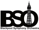
The orchestra wanted Blackpool Tower in the design but we're happy with any other changes made.
Here is the orchestra's original logo:

This it the design I have settled on:

I have created a few very different examples:


Am I on the right track or should I really Give up?
The orchestra means a lot to me and I don't want it looking too amateur.
Thank you very much for your advice
Tom Goulding
I play for a small orchestra and I wanted to create a new logo for the Orchestra. I am a complete novice but the orchestra doesn't have the money to hire a graphic designer for the project.
I have come up with a few ideas and I'm looking for honest critical feedback (internet is the best place for this).
The orchestra wanted Blackpool Tower in the design but we're happy with any other changes made.
Here is the orchestra's original logo:

This it the design I have settled on:

I have created a few very different examples:


Am I on the right track or should I really Give up?
The orchestra means a lot to me and I don't want it looking too amateur.
Thank you very much for your advice
Tom Goulding