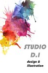
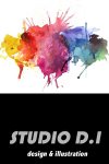
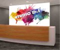
Hello, I am currently a graphic design student and I’m seeking feedback for business cards designs and a 3D signage/installation for an assignment.
The Design brief I was given was for a reception area of a new design studio.
‘Studio D.I’ is a graphic design studio that specialises in creating digital graphics and illustrations that are used for web and print. They are looking to feature and design 2D business cards with company logo and eye-catching 3D signage to display in the reception area.
They pride their work on being bold, colourful and contemporary and these keywords influence and attract their clients/target audience who seek new and creative ways to display digital content.
The three cards designs I have uploaded I have gone with a concept that displays colour dramatically and used bold shapes and fonts.
Any feedback and constructive criticism on card designs and signage would be greatly appreciated thank you.

