StashBoxxx Logo - P.S. Take hint at the Triple Xs

Jed

Member
Yo ppl,

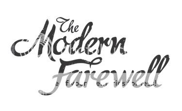
Welp I made my first finished and happy with logo XD. it just so happens to be for a website I decided to create - a very crude one too but hey when inspiration hits XD.

Anywayz I wanted to see what the feedback would be on the logo. XD hand Photoshopped - too comfortable to transition on the text in illustrator XD.

LASTLY, if you not a fan of the topshelf then dont go to the site. I have enclosed the image in code tagss for that reason XD.

Code:
http://img245.imageshack.us/img245/5889/logofl.png
 
My Bad. The StashBoxxx is the actual Logo but the Box is the Motif (I think that is correct).

Ignore the background - that is from the site XD.

Btw ignoring the background is it still a banner? And how comes the logo should be one colour?
 
When I say should, I do mean should, I'm going to pick on my own work as an example and explain

logocopy-1.jpg


recent example of my work, for my band, clean concise logo that in its basic form is one colour, it could be easily adapted into other colours if needs be, but as a bass line one colour.

logocopy.jpg


Another band logo, could easily have different colour elements to it, but still stands out clearly in one colour

chainsfinal.jpg


another band, but if I was to present this as a logo, i would present it more like this

Untitled-1-5.jpg


this was the basis for a stencil, so lacks any real character.

Do you see what I mean?

Most logos boil down to a simple one colour mark. It's not always true, but it is a good way to think about it.

I think this is a font map, but kinda re enforces my point, they are all one colour.

famous_logos_map.png


Whilst they may get presented in different colours, the bassline is black.
 
Input.

Basically think one colour and make it interesting, its the real challenge behind doing logos.
 
mrp2049 said:
Depends how you look at it :rolleyes:

But yes, basic rule of thumb is that it should work in a single color (or possibly just two different shades of grey). And even if you have a very distinctive mascot or emblem that just won't work in black and white, you still need a text logo. I'm not really feeling the text here either, it's far too generic.
 
Invaluable feedback guys thanks. I actually thought the same thing about the text funnily enough - its a standard font with a few photoshop edits. Guess its back to the scrap paper for more concepts!

Also do you reeckon I would have more of an advantage if I used Photoshop's Pen Tool for the text (once scanned) or would using it as a intro to illustrator see me get any benefits?

Onartis said:
Depends how you look at it :rolleyes:

Exactomundo XD - though tbh I just typed it in reflexively and figured it would work in place XD.
 
Photoshops pen tool isn't pure vector actually and is very prone to jagged edges; I believe they refer to it as "vexel". Getting to know Illustrator will help you out in the long run as well, so go with that :)
 
Back
Top