So I was wondering if I could get some feedback or suggestions on the promotional material I have designed for my university's Art Society? The logo is fine but I am having trouble seeking a second font to pair it with, and some ideas on how to present it through physical and social media advertising via the facebook group.
Here is what has been put out so far:
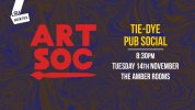
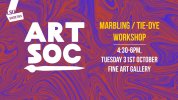
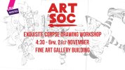
The logotype is called 'Maskoolin' - I thought a bolder typeface with red would make it more eye-catching when people scroll through.
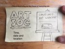
Also below is a current idea I have where aside from the logo, a blank canvas says a different title for a workshop running.
Much appreciated
Here is what has been put out so far:


The logotype is called 'Maskoolin' - I thought a bolder typeface with red would make it more eye-catching when people scroll through.
Also below is a current idea I have where aside from the logo, a blank canvas says a different title for a workshop running.

Much appreciated