Site Draft Review

S

Squiddy

Guest
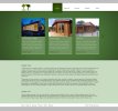
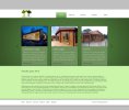
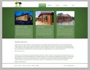
I've recently taken on a job which required me to create a site draft in a pretty short amount of time. Now that I've got a bit more time to work on it I can look at the smaller details of the site. I like the concept but I feel that the smaller details don't look as good as they could together.

Any advice would be greatly appreciated.

(the grey at the top and bottom is the background and no I didn't create their logo!)
 

Attachments

  • design draft.jpg
    design draft.jpg
    85 KB · Views: 22
Thanks for the advice so far, I'm currently making some adjustments and will post up a revised version in a little while. Is there anything else that can be done to improve it?
 
Okay, I'm much happier with it now. I'm not quite sure what to do with the footer though, it seems a awkwardly placed and I'm struggling to make it look decent.
 

Attachments

  • index.jpg
    index.jpg
    83.2 KB · Views: 14
The footer might be a problem simply because of the dark green top boarder. Try messing with that to play down the footer as a legitimate section.
 
Thanks, I have made quite a few improvements and I'm surprised at my self because it usually takes a lot longer than this to come up with something that I'm happy with overall! You'll have to excuse the ghosting on the images :p
 

Attachments

  • index.jpg
    index.jpg
    85.4 KB · Views: 15
I have got to admit I do prefer the last version I was thinking in the top two there didn't appear to be a direct light source which was causing the shadow effects, in the last one it now appears directly above the page, so yey. :)

The bit that to me stands out from being too oddish, maybe not the right word, is the logo, couldn't you look at making it bigger and incorporating into the design it standing out a bit more, maybe?
 
Also wouldn't the bottom of the design benefit from having the bottom 2 sections side by side, 50% width, rather than one under the other, maybe?
 
Thanks for the feedback Jaz. I know what you mean about the logo - It looks horrible and is not helping the design in any way - I think it would look better with the white navigation background being a little less tall.

What I'm hoping to do is convince them to allow me to redesign their logo, for which I've already sketched a couple of ideas down that would work well with the site.

I agree with what you're saying about the split content (I thought you were referring to the footer at first, I was like Isn't that what I did? haha) I have actually taken out the second section of text and am going to put some call to action buttons in its place. However, if they decide they want more text on the home page then I will definitely do what you suggest.

Thanks again mate :)
 
Do they not have a contact page?!

I'm not too sure on the font to be honest, Futura or Frutiger is it?! I would really only use a fontface on the headings and stick to a web safe font for the body.

I think the body would look better maybe if it was split into a 3 column with the text taking up the left 2/3s and having your call to action buttons on the right?

It might look better to crop the top of the log cabin boxes at the top of the green area?! Or it might not...

It all feels a little clinical though, not really the kind of thing I would expect from log cabins with a specific and inherent texture and feeling. I just think maybe you could build on the subjects aesthetics a little more into the design... or just infuse a little character at least.
 
As the title states, it's a draft. They most certainly do have a contact page! The font is called GeoSans Light, but I understand what you're saying. In truth it's only that font because it was the last font I'd used in PS, lol.

As for your other comments, I agree with them too and I'm going to have another play with the layout and definitely try to make it less clinical looking! Thanks :)
 
The bit that's really troubling me the most is the spacing, the gap between the top of the images to the navigation and the gap between the find out more to the bottom of that panel need to be even in my opinion.
 
Back
Top