Thanks for the feedback Shauna/Jamie,
Im glad you like the 1/3 A4 size, the whole way through the project so far Ive stuck to an A6 but after printing it out for the first time last night it looked so small, and some of the smaller details were tiny! Im not sure if the bride and groom will go for it, but im gonna suggest it.
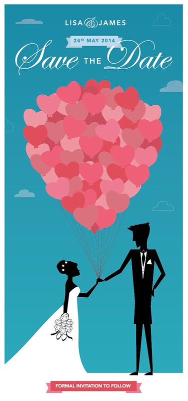
Jamie, I too prefer the sans serif font but I gave the bride some options and she wasnt a fan, she really wanted a scrpit. The pink banner at the base of the design is a good idea, Ill give it a try. On the bride and groom illustration, there is a big height difference in real life which is what the design aims to show, but I never thought of giving the bride some feet, ill try that!
Thanks!
(if anyone else has any comments, please keep them coming! This is a huge help!)


")