You are using an out of date browser. It may not display this or other websites correctly.
You should upgrade or use an alternative browser.
You should upgrade or use an alternative browser.
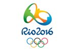
Rio 2016 logo...
- Thread starter @GCarlD
- Start date
probably but then it is rio..... they are known for their festival that uses very little clothing...I don't like it. Is it me, or is it overly phallic?
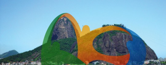
Actually Rio Olympics logo was created by brazilian company Tátil Design. Basically the idea behind the logo was also to depict the Rio de Janeiro. which is surrounded by mountains.

If you are interested for full story you can read it here > How The 2016 Olympic Logo and Font were Created

If you are interested for full story you can read it here > How The 2016 Olympic Logo and Font were Created
@GCarlD
Well-Known Member
Ah, the luxury of having people write articles to explain what the ideas mean...!!
Exactly! I cannot fully accept that either, as that is not the shape of the mountain haha. I accept that they were inspired by the mountains.
Better than the 2012 one though I'd say!
At least the 2012 logo didn't need a whole article to explain the design, the design itself was pretty self-explanatory; but then maybe it's because I'm a Londoner... Design should not need an interpreter or an explanation, that is going into the subjective realms of art.
Paul Murray
Ultimate Member
Last time I saw this logo it was accused of being plagiarised. Same thing happened with the Tokyo one. Designing an Olympic logo must be more hassle than it's worth.
