You are using an out of date browser. It may not display this or other websites correctly.
You should upgrade or use an alternative browser.
You should upgrade or use an alternative browser.
Review of Logo Design- Would love your take on it
- Thread starter shrinkshrinkshrink
- Start date
Wardy
Well-Known Member
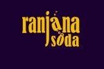
I think it's a bit too contrived and certainly needs to be simplified - it wouldn't be too legible if it was very small because of the tilted letters. There's no
real reason for the j to be that long - it almost reads as isoda.
I would try the bubbles coming from just the j maybe, or from the o if the text was all in one line. Maybe just have the o as a bubble, but you would need to have
a font with a nice circular o.
real reason for the j to be that long - it almost reads as isoda.
I would try the bubbles coming from just the j maybe, or from the o if the text was all in one line. Maybe just have the o as a bubble, but you would need to have
a font with a nice circular o.
It reads pretty legibly to me, I don't have an issue with the typography at all.
I don't understand why letters are deformed though in twisted shapes, and the bubbles don't look good at all.
Overall, a strong concept, but needs refining.
I don't understand why letters are deformed though in twisted shapes, and the bubbles don't look good at all.
Overall, a strong concept, but needs refining.
Choose a nicer font and just have the O as a bubble, slightly lifted to the rest of the text with a bit of reflection
Jri
Member
The subtle backwards slant distortion on the tilted 'a' in ranjana is killing it for me.
Also, the boldness of the bright text standing out against the dark background is undermined by having too many of the bubble shapes overlap other elements - thus making them hard to define from each other.
This.
Also, the boldness of the bright text standing out against the dark background is undermined by having too many of the bubble shapes overlap other elements - thus making them hard to define from each other.
Overall, a strong concept, but needs refining.
This.
New Perspective Studio
New Member
For me the bubbles need some work not to overlap or maybe even touch other letters the s looks like it isnt part of the soda word when i read it. It could be that j or the a but it seems isolated. Just from a branding perspective have you though about the relative sizing of the two word one being the product and the other being the brand... the tail of the j seems cut off it doesn't have the kerning that it should which makes me think you just stretched it out and clipped it. I could be wrong when i look at this quickly though i think fish ( but i am a strange fellow ).... That could be the colours and the bubbles and the j looking like a hook. I would love to see what the current logo is though.

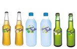
I assume this is the old logo ?

I assume this is the old logo ?
