Hi all,
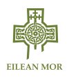
First time poster. I've been asked to design a logo for a heritage trust. The logo must have a medieval cross that was found by the trust as its centrepiece.
However, I'm a photographer with negligible graphic design experience--getting to grips with Illustrator was fun--but I gave it a shot (see "cross" attachment). It was a case of trying to combine the intricacy of the original Celtic knots with the simplicity of the best logos. It looks somewhat clumsy to me.
I then messed around with some filters in PS to try and roughen up the edges. The stamp filter (nothing else was used) seemed to give the best finish. The result ("cross_filter" attachment) looks a bit better but I wonder if it could be improved on?
So, what I'm wondering is if anyone knows of a very quick filter or combination of filters that could be applied to the original "cross" image to give some "sparkle" to the original file? This is very vague, I know, but to an extent I'm going by feel here. Watercolor effect? Stone effect? Carte blanche rules.
It sounds like a logo design on the cheap--which it is. But if someone has an idea that could quickly be applied to the file, I would be very grateful as this is an area I'm very inexperienced in.
Best,
Ray
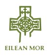