poster artwork 1st draft

ajscott83

Junior Member
poster-4-web.jpg


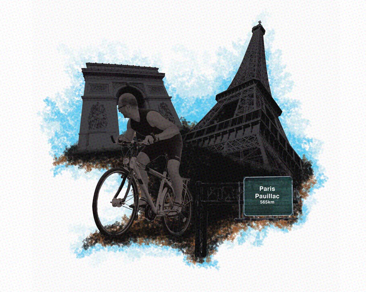
I've been asked to design a poster promoting a charity bike ride from Paris to Pauillac, France, the charity is Alzheimer UK.

This is my 1st draft of the artwork that i will be using on the poster. What does everybody think so far? Personally i think the guy on the bike, needs a bit of work, need to blend it in more or something. This is the 1st creative piece i've made in 8 months now, i'm a little rusty :)
 
it's not too bad, first thing I would do though is brighten the whole thing up, try using a light shade of brown or even try another colour, it's just too dark at the moment. Personally I don't particularly like the microdot overlay, with the hussle and bussle of the rest of the poster the dots kinda add to that and makes it quite a confusing picture, would probably look fine without it. The sign also needs to blend in more, try and give it more of a style like the rest of the poster, or even the other way round by using the shade of green to overlay over the main part of the poster that could look good. In all though I like the composition.
 
cheers i'll take that on board, you're right about the dots, i dont know why i added that in. I'll keep playing around with it, see what happens...
 
Back
Top