You are using an out of date browser. It may not display this or other websites correctly.
You should upgrade or use an alternative browser.
You should upgrade or use an alternative browser.
Portfolio Crit Please
- Thread starter Xenonsoft
- Start date


lukedavies
Member
Personally, even though i'm young and all that.. i prefer the first one ") (mainly cause there's less fuss on the top)
(mainly cause there's less fuss on the top)
(mainly cause there's less fuss on the top)ralphsaunders
Senior Member
You'll find it will look a whole lot better when you start increasing the whitespace around elements. It will also look a lot better if you make your padding consistent.
Aarlev
Member
Hi Fred,
Agree with Ralph. Really needs some whitespace. Typography needs work (not sure right aligned on the left works with left aligned text on the right either. Why suddenly a font change for the "Tweeted" ?). I'd look into adding some better visual separation of elements and areas.
There's is a lack of hierarchy I think and it looks a bit messy. Don't know what's most important or where to look really. Perhaps add an accent color, it's looking very grey and slightly dull. Stuff like the "available for hire" badge is far too big and poorly executed. Work on details a lot more.
Hope that helps!!!
Soren
Xenonsoft
Active Member
Thanks Soren, that sort of advice is what I'm looking for.
Things like the hierarchy is definitely something I need to learn to bring out more, making certain elements draw the eye more than others and things like that. I've not really looked at adding colour yet, I realise that might sound weird but I've mainly looked at layout, now I need to look at what I want to stand out above the rest and tweak accordingly (using colour etc).
Appreciate the advice and will definitely take it on board.
Xenonsoft
Active Member
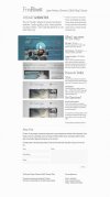
Right, went back to the drawing board and this is where I am at the mo. Pretty pleased with it, think I'll move onto coding it soon, but if you guys see anything obvious please point it out, whether a small detail or something bigger, all feedback welcome. Not sure what I'm doing with the 'FredRivett' and 'Available for Hire' banners yet, whether to leave them hanging outside or to curl them back, as is the style these days.
(please note that the wording isn't finalised, but is just in there for now).

(please note that the wording isn't finalised, but is just in there for now).
j.edmund
Junior Member
Fred said:Right, went back to the drawing board and this is where I am at the mo. Pretty pleased with it, think I'll move onto coding it soon, but if you guys see anything obvious please point it out, whether a small detail or something bigger, all feedback welcome. Not sure what I'm doing with the 'FredRivett' and 'Available for Hire' banners yet, whether to leave them hanging outside or to curl them back, as is the style these days.
(please note that the wording isn't finalised, but is just in there for now).
I don't think you need a contact form on every page, or even the homepage. It makes you seem a bit desperate (which maybe you are, but you don't want to seem that way!) About and contact pages generally can go together or be separate, your call, but personally besides a line to an email address in a footer or something, I wouldn't place it on the front page or any of the project pages, its simply too heavy visually and experience-wise.
The added benefit of this is you get a lot more space to display the work on the page, with larger images, more space for processwork, text, you name it. The images are a bit squished as it is.
If people want to get in contact you, then they will find a way to do so. I promise!
edit// also, its just my own personal style I guess but I was never a big fan of the large header type. It seems to be the trend nowadays, but as a user I want to see people's work first and if I want to learn about them, then I'll do it after. Really you should be selling me on quality of work and not witty catchlines describing what you do with words. Again, thats my own personal preference.
The visual design on this one is ultimately a lot stronger and I feel like you can do a lot more with this than the previous iteration, since theres some semblance of a maintainable grid. Make sure to use the same number, or some multiple thereof for paddings and margin and it will really fall together well.
Xenonsoft
Active Member
Cheers Berry.
Thanks for the feedback Justin, I appreciate the points made and the time spent giving them
Yeah, that's a valid point. I'm just wanting to make it easy for people to do everything in one place really, the separate pages will be kept to a minimum. Might remove it and just have the link at the bottom, with a modal window. We'll see.j.edmund said:I don't think you need a contact form on every page, or even the homepage. It makes you seem a bit desperate (which maybe you are, but you don't want to seem that way!) About and contact pages generally can go together or be separate, your call, but personally besides a line to an email address in a footer or something, I wouldn't place it on the front page or any of the project pages, its simply too heavy visually and experience-wise.
The added benefit of this is you get a lot more space to display the work on the page, with larger images, more space for processwork, text, you name it. The images are a bit squished as it is.
If people want to get in contact you, then they will find a way to do so. I promise!
I understand that. For me my website is partly an example of what I can do in of itself, a package as it were, as well as showing my client work. But yeah, the work is the selling point (as well as what the clients have said) so they need to be emphasised clearly.j.edmund said:edit// also, its just my own personal style I guess but I was never a big fan of the large header type. It seems to be the trend nowadays, but as a user I want to see people's work first and if I want to learn about them, then I'll do it after. Really you should be selling me on quality of work and not witty catchlines describing what you do with words. Again, thats my own personal preference.
The visual design on this one is ultimately a lot stronger and I feel like you can do a lot more with this than the previous iteration, since theres some semblance of a maintainable grid. Make sure to use the same number, or some multiple thereof for paddings and margin and it will really fall together well.
Thanks for the feedback Justin, I appreciate the points made and the time spent giving them
Xenonsoft
Active Member
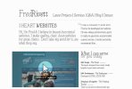
I sat down again to look at finally getting something online and didn't like either of the first two iterations (the first one did nothing for me and the second seemed to OTT).
I've come up with a very simple grid based layout below which gives the information required and shows the work I've done.
I'm not sure about the navigation items yet so that'll probably change, but I'm humbly looking for critique on the feel (visuals) & hierachy of the site. I'd love it if you could give me any pointers as to where it succeeds / fails.
Thanks, Fred.
[note1: Writing copy isn't my forté so I'm not too sure what to do with it (esp. the header text)]
[note2: Item 1 is shown with the hover state, it will pull out to the left and come to life a little with the click through details hover]
[note3: I'll probably tweak the contact form to provide a little more information but that's a minor detail].