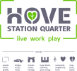
The beginning of the vid shows what the logo needs to convey, the end shows logo variants. As you can see, three graphic elements are an important theme.
My client is a committee who cannot agree. Is it worth persisting with three graphic elements inside the letters, or just one in the biggest "O"?
Background info....
Logo Brief:
- Self-contained
- Symmetrical
- Must work alongside sister brand (same font, proportions, etc.)
- Must reflect the architecture and convey community, green pocket parks, heritage, conservation
- And also, creative, vibrant and dynamic - a great place to live, work & relax.
Most of the time the logo will appear as a two-tone square with the strapline, but sometimes it will need to be an animated multicolour logo or a compact avatar.
