Personal Trainer Logo

theking79

Member
This is a logo for a personal trainer based in Malawi, there is no language barrier as everyone speaks English, particularly in the area the trainer lives in.

The main audience is Business owners and managers, as they are the only people who can afford his services.

This is just the logo but the whole brand will be conveying the need to exercise in relation to health, and the health benefits it brings, most of the clients he gets are overweight, so the goal is to lose weight, he also advises on nutrition.

Because the trainer is on his own and his service is quite personal, I thought it would be appropriate to give him a initial or signature type logo, but unique to him in terms of style.

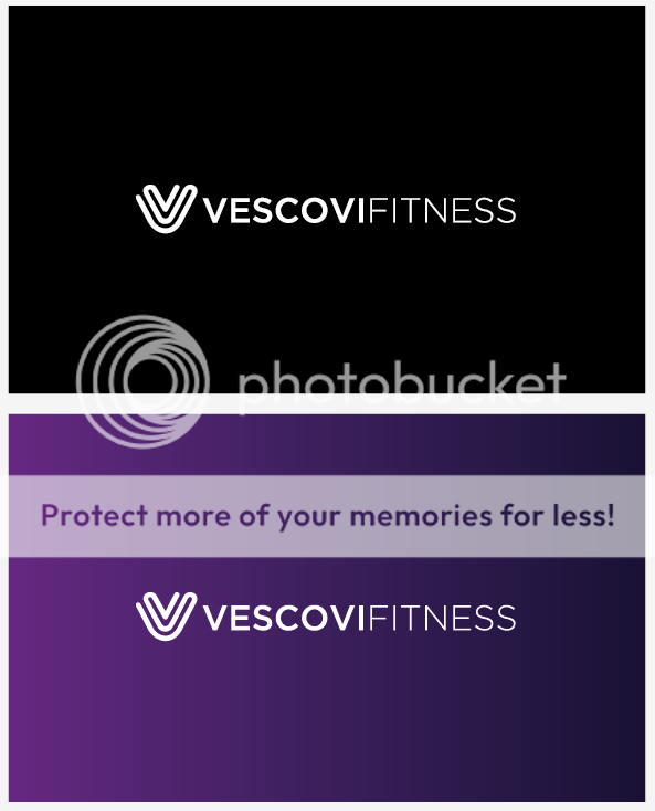
screenshot20111110at012.png
 
I like the text and font formatting but really not sure about the symbol, it does work in a way but I'm just not quite sure, any other versions of the symbol?
 
its just the weight of the symbol that's off. get it the same/similar to the text and your onto a winner.
 
I think it's excellent, however, I agree with br3n.

In addition to that, I'm thinking that firstly the font weight of Fitness is a little thin, secondly, I like the font, but I don't really like the rounded caps/ends of the characters. I know it's a very small thing to mention, but I always found hard edge fonts to be more synonymous with professionalism/luxury/exclusivity and helps to give it a more serious tone.
 
The font on the Vescovi looks nice not sure about the fitness? also the kerning between the N and E needs reducing? What was the thought process behind the logo what does the symbol represent?
 
As a design it's nicely executed, and certainly says something high-end, but I can't see the fitness link as a logo; the 'V' shape reminds me of a paperclip, or an illustration of how paper is layered (is there a logo using the letter 'C' with concentric lines similar to the 'V' above...?).

I'd also be interested in seeing other versions that didn't make the final shortlist.
 
I like it!
I kind of get a fitnessie feel, it's like someone doing crunches or something.
But I also think it can be a rather generic logo used for other purposes as well.

All in all I say go for it, maybe mess with the weight a little bit, see what might look nice.
 
leelovesbikestoo said:
As a design it's nicely executed, and certainly says something high-end, but I can't see the fitness link as a logo; the 'V' shape reminds me of a paperclip, or an illustration of how paper is layered (is there a logo using the letter 'C' with concentric lines similar to the 'V' above...?).

I'd also be interested in seeing other versions that didn't make the final shortlist.

The logo is more of a unique signature for the personal trainer, it's not supposed to be literally showing something about fitness, the word 'fitness' says that, and also the brand identity as a whole when developed will point towards fitness.

The logo is meant to be showing that if you use this personal trainer, your getting professionalism and quality. The logo mark is sort of a seal of approval, that this is not just a conventional way of personal training, it's the vescovi way if you like.

The idea behind the mark was transformation and flexibility, and obviously the V initial, as the brand identity gets developed I will be experimenting with the logo mark and there may be variations of it.
 
I think this typography is much stronger and it works really well with the purple. Are these the colours that the client wants to use? The business card looks very professional and exclusive.
 
Jordan said:
The font on the Vescovi looks nice not sure about the fitness? also the kerning between the N and E needs reducing? What was the thought process behind the logo what does the symbol represent?

Looks good. Nice and strong but Jordan is right, the kerning needs to be tightened between the N and E slightly.
 
Back
Top