You are using an out of date browser. It may not display this or other websites correctly.
You should upgrade or use an alternative browser.
You should upgrade or use an alternative browser.
dot design
Member
Cheers Mike, and its Coxon... Gareth Coxon (said in a bond stylie)!
Mike said:My perception of Pepsi, is that it is very much of the "rola cola" ilk - ie an imitation
I think any company that can afford David Beckham for an advertising campaign is a little more than a "rola cola" or an imitation. The wording 'imitation' is interesting and probably as a result of Coca-Cola's awesome branding power, oh and their advertising slogan 'the real thing'! I do however get the feeling that Pepsi is better known in the States than it is in the UK, apart from the KFC/Pizza Hut franchise in the UK.. oh and Wetherspoons chains, come to think of it they're around quite a bit now!
Just noticed this post on the adgrabber site with the promotional video from the DVD that was sent out to launch the new packaging - Pepsi Unveils Packaging to 'Digital and Social Media Influencers' - AdGabber (it's similar to the YouTube one I linked to earlier in the thread at the start but goes in a different direction towards the end)
and here's a photo of the packs they sent out to teh 25 "digital and social media influencers"..

Anyone more convinced yet? I'm certainly not!
Greg
and here's a photo of the packs they sent out to teh 25 "digital and social media influencers"..

Anyone more convinced yet? I'm certainly not!
Greg
philjohns
Senior Member
I have to say I do like the variations of the logo and can see what they mean. Normal Pepsi is medium, Pepsi Diet is thinner to represent dieting etc and Pepsi Max is just large to represent itself and the opposite of dieting.
I dont howver like the packaging of the pepsi bottles. Mountain Dew's design is nice but the pepsi bottles just look like they are a supermarkets own brand of drink to me
I dont howver like the packaging of the pepsi bottles. Mountain Dew's design is nice but the pepsi bottles just look like they are a supermarkets own brand of drink to me
Purplegurl
Senior Member
I really think pepsi are shooting themselves in the foot with this ...... the pepsi logo is iconic around the world... its a powerful brand that is well known and loved .... why on earth would they want to change that???? the term 'if it aint broke dont fix it" springs to mind ... although saying that the logo has not really changed significantly enough to become unreconisable as pepsi but yes I do think they are coming seriously close to looking like a cheap imitation of itself .... undecided really
twiggy8520
Senior Member
To really put a spanner in the works, i actually like the new design. Im not sure if i agree with the mantra 'if it aint broke dont fix it', sometimes a brand needs to refresh its image. With Mountain Dew i am beginning to get sick of everywhere i turn this whole "drop the vowels and any other letters"
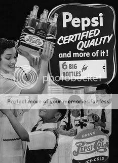
Forget this style though, advertise like this;

Forget this style though, advertise like this;

I personally think it could have looked really cool if Pepsi had gone really retro, by introducing some elements from the very early advertising like the old script like logo but in a modern presentation. In any case it will be interesting to see how the new branding goes down, and ultimately if it has a positive/negative effect on their sales... only time will tell.
i think its dreadful. and dont think it will be long before its dropped (along with a few marketing execs  )
)
great crit here:
Pepsi rebrand
(via speakup)
great crit here:
Pepsi rebrand
(via speakup)
br3n
Senior Member
I'm going to go out on a limb and say that these ideas were pitched about 1-2 years ago and its taken that long to go through the various stages of management/pr etc to finally consider it, they look pretty cutting edge a couple of years ago. shortening mountain to mtn is a blatant example of this.
Lee Newham
Junior Member
In light of the coca cola rebrand, which is brilliant, it's poor.
It looks a bit feeble and weak. It's charmless and lacks any attitude or confidence. The idea is lost.
As for the white space in the ball, does it mean diet coke is less pepsi and max is more pepsi? Does pepsi max have more sugar in it than normal coke? Is it sweeter? And who would notice it unless it's in a nice publicity picture where all 3 bottles are shot together?
Did Anyone bother to look at this pack on shelf? Turn it 10% and the branding dissappears. A disaster.
masterpagedesign
Member
lol "mtn dew" for the sms generation! ;-)
Spotted this great response to the new Pepsi logo - blow at life: Pepsi Logo - a response 
Skipper
Junior Member
The simplicity is a little much in the new logos - but I still like them. The label and logo of the brands are there in a neat fashion, and fit together with the easy-going look.
...but if I was choosing a nice, cold drink between a coke or a pepsi, the coke would probably win my lips. The bottle just doesn't scream "grab me!" anymore.
However, I do like the new shape of the bottles; they add a nice touch (if those are even going to be implemented)!
...but if I was choosing a nice, cold drink between a coke or a pepsi, the coke would probably win my lips. The bottle just doesn't scream "grab me!" anymore.
However, I do like the new shape of the bottles; they add a nice touch (if those are even going to be implemented)!
