generalsoulfly
New Member
Hi Everybody,
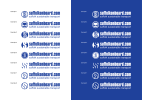
I'm looking at developing the image mark to go with the existing wordmark.
Suffolkonboard.com promotes all modes of sustainable transport in Suffolk and has been around since 2004 as a brand. I've created some ideas, please could you let me know any constructive criticism of these designs.
Many thanks.
