I think you should stick wih the idea James, just look at the conversation posting the design has sparked on here, if your business card can create that conversation (an ice breaker) or become memorable off the back of the design, ie a talking point, then IMO it's done its job very well, scannable or not.
You are using an out of date browser. It may not display this or other websites correctly.
You should upgrade or use an alternative browser.
You should upgrade or use an alternative browser.
Opinions on Business Card.
- Thread starter James Random
- Start date


Alex Printedeasy
Member
Yea there is no way someone should have to design their cards so that someones card scanner could read it. How long dose it take to punch a phone number into a pc anyway? Maybe if you were processing like 50+ cards a day but how many people do that.....
James Random
Member
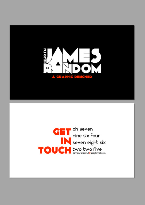
Having a huge amount of trouble finding a typeface that compliments the typeface currently in use (which is called KiloGram). Any suggestions would be helpful. Arial/Helvitica are banned.
davewill
Senior Member
Yeh Greg, if you look at James' earlier work samples on another thread, he has designed a nice clockwork orange poster which looks similar to his own logo. i disagree with you though when you say that james' card has sparked off such a big reaction. peoples reactions seem to be based on his reasoning and judgement relating to his card details, rather than the design itself.
As for the scanning debate, i agree that you shouldnt have to design your card just so a scanner can read it, but surely for those clients who do use technology it wouldnt hurt to make it user friendly. That is what design communication is all about.
I think your right James when you say you dont want to let gimmicks rule your designs, and that is fine when you are doing design just because you love it and you enjoy it, but if its something you want to make a business out of and make money from then thats a completely different scenario.
________
SiZzlinPuSsyHottie cam
davewill said:I think your right James when you say you dont want to let gimmicks rule your designs, and that is fine when you are doing design just because you love it and you enjoy it, but if its something you want to make a business out of and make money from then thats a completely different scenario.
exactly
")
It's also not just your business card that makes you memorable, your work and personality do too.
James Random
Member
Yeah. Still struggling to come up with a complimentary font! Hah!
ralphsaunders
Senior Member
Surely a business card is meant to communicate key bits of information and making that information hard to process is counter productive...
James Random
Member
ralphsaunders said:Surely a business card is meant to communicate key bits of information and making that information hard to process is counter productive...
I've never found typing a phone number into my phone to be all that difficult that I could not
possibly accept someone's business card if that was indeed the case. lol.
ralphsaunders
Senior Member
I am referring to the use of words instead of numbers on the back.
James Random
Member
ralphsaunders said:I am referring to the use of words instead of numbers on the back.
Yeah but if I put 'phone me' next to a set of numbers (even as words), one would need to be particularly slow to not figure it out.
ralphsaunders
Senior Member
But why make it different? I'm all for doing stuff differently if its better but I see no pro's to using words.
James Random
Member
ralphsaunders said:But why make it different? I'm all for doing stuff differently if its better but I see no pro's to using words.
I like different. It's not tragically bad. So why not? I am not a fan of trending and this trend of technology defining the way we design (in this case phone number scanners) just seems ludicrous in my view,
ralphsaunders
Senior Member
Different can be good but it can also be bad, i'm not sure if its good or bad in this case. I don't think people write phone numbers as numbers for scanners but because a phone number is what it is, a number rather than words.
James Random
Member
ralphsaunders said:Different can be good but it can also be bad, i'm not sure if its good or bad in this case. I don't think people write phone numbers as numbers for scanners but because a phone number is what it is, a number rather than words.
I am truly not bothered about the scanning side of things. I think if i've made enough of an impression on them before handing my card over, the concept of being written or numerical
will be a non-entity.
HippySunshine
Senior Member
I like the front but hate the concept of the back.
Or maybe its just that font and the arrangement? Hmm not keen.
Or maybe its just that font and the arrangement? Hmm not keen.
James Random
Member
Numero Fouro.
and number 5
and number 5