New Identity

Thanks for your thoughts. I'm happy with the colours though. I made a conscious decision to use only two colours, I'm not a great fan of using many shades within a design, especially a branding project. The two colours I've used work well together, and the orange gives a good srong impact against the grey. Don't really agree that it looks old and boring. Light blue would seem a little washed out compared to the vibrant orange. I think the orange gives the whole thing a nice punch to it.

I've made a few alterations to the illustrations:
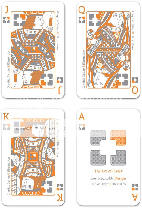
CARDBACKSAMPLES-1.jpg


I've completed the remainder of the suit including a joker and a patterned card back, and I'm very happy with it as a display piece.
Once my new website is up and running (when I get round to it), I'll put he whole lot up.
Cheers for all of the input. I will no doubt be posting web visuals soon enough for yu to take a look at.
 
Nice work man, that looks like some heavy duty illustrator work.

Make sure you use a spot grey and not a percentage of black.
 
The idea is great but I only like the last one, I saw the other three just as clarification of the last one. Because if you only show the last one some people might not understand it at first glance.

PS: does your King have an iPod ?
 
Thanks for your thoughts.

The grey is a solid, Pantone Cool Grey 9. You're right as well, it's all originated in Illustrator.

As for misunderstanding the concept, I'm not sure there's a lot of room for confusion?

They are designed to work independently as an interesting reverse to my business cards. I'm quite confident that the Ace explains itself clearly enough. The whole thing is quite a loose concept anyway, there isn't that much to "get" about it all. I think they're just a good branded showpiece.

And yes, the king does have an ipod. I tried to put a few nice little details in there, that I thought were fun.
 
If anyone 'doesn't get it' then you don't want to be working with or for them. It'll be a nice way of weeding out potentially annoying clients.
 
matt said:
If anyone 'doesn't get it' then you don't want to be working with or for them. It'll be a nice way of weeding out potentially annoying clients.

Haha, nice way of looking at it :D
and yes there's not a great deal to get... but it's still clever in a simple way, a chance to showcase your illustrative skills and a bit of fun, they look great to me Ken :up:
 
Hey they are good mate, the colours go well together and like Greg suggested i think giving them out to your best clients would be a good idea. :up:
 
Ken these are awesome, I love them! The brand has developed brilliantly and those card illustrations are wicked - I've tried doing a face card design before and I know how awkward they can be to get right!!

Illustrated Song Titles: Killer Queen - Jones

I produced some other cards for my wedding a year or so ago too (gifts for ushers etc), got them produced digitally, came out at about £10-15 per pack. Worth doing I reckon! Here's how they ended up coming out.

ARTBOYART / Wedding Branding
 
Thanks for your comments, all very appreciated.

@ Owenjones, that's some great work, I've always found it difficult to come up with good ideas for wedding themed work.

I've been trying to pull all of my portfolio work together, but paying work is once again reasserting itself! It always happens when you think you're getting somewhere doesn't it. Probably shouldn't complain though.

Having said that I'm happy with what I've produced and there is always plenty of time to think about how I can use it to it's full potential.
 
Back
Top