HamisH007
New Member
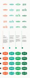
Following a very helpful a/b testing and evolution here (/a-b-test-and-critique-on-logo-concepts.25707/) . I explored another direction that resulted in three more versions. I'd appreciate any and all constructive critiques. I'll be presenting to the client soon with the aim to select a final direction. From that I'll work on any revisions and then polish
Background on these concepts for context.
• business is for a combination of services to assist young professionals with getting fit physically and mentally.
• customers are college/uni, or new professionals who know coaching will help them get to a higher level of performance in work/school (perhaps sports as secondary)
• service is professional Physical Trainer and Psychologist who coach and prepare programs to help clients overcome all types of mental and physical challenges
• clients are middle income bracket
• location is a hipster-driven brand city (to a fault)
• ask away if something's not clear/conflicting in logo
Round One:
• presented 9 unique concepts. From that, client provided feedback going in a popular hipster style theme.
• client preferred a boxed in (crest) style.
• I want/need to appeal to the hipster theme appeal that is so popular, yet have a longer shelf life.
Round Two:
• most all feedback said the word marks were better on their own. I'll provide an alt crest version to the client.
Round Three:
• colours can always change. I'm batting around these options as they follow balance/relax/safe (Greens), optimistic/happy/positive (Oranges), but Im using vintage tones of the hues. But in this market, black is the norm and these work well in black too.
• these are near final form, just need to get down to the ONE
