Tin Woodsman
New Member
Hi guys,
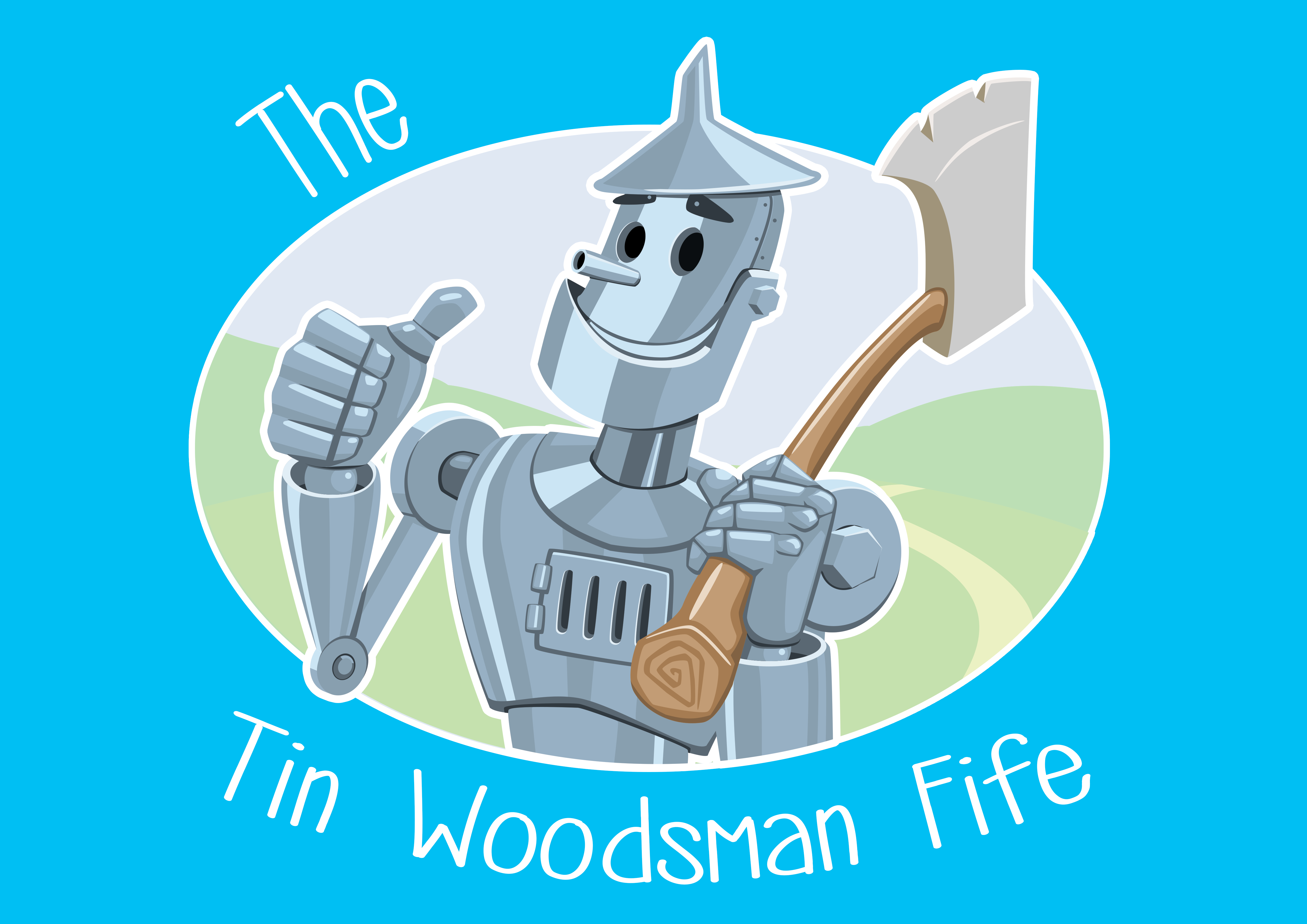
Basically I have just launched my own garden services/lawn care/tree surgery business. Everything happened quite fast due to being made redundant from my previous job and I needed to get an identity out there quick. So I put together a logo in a couple of days and I've already had it made into business cards so I can start passing them out.
Here it is as the front and back of my current business cards as they are currently.


What I am essentially asking for help with is the general shading of the character as I'm just not quite happy with it. Some bits look ok and convincing enough as a cartoonish metallic and other bits like the shading on his chest just doesn't feel right. Obviously if anyone can offer a quick mockup of suggestions I go go back in and easily change things. It's all vectors done in Photoshop (don't use Illustrator though I know I should).
The font is also a placeholder for now. I wanted something to fit the theme, be easily legible and not over the top. If anyone thinks they may have a good font suggestion that would be good too (of course I will purchase a license).
Obviously I can explain some of the reason for the character choice if people really must know/or are interested. Nothing convoluted, a few simple reasons. I mostly didn't want to be generic.
Thanks in advance.
Basically I have just launched my own garden services/lawn care/tree surgery business. Everything happened quite fast due to being made redundant from my previous job and I needed to get an identity out there quick. So I put together a logo in a couple of days and I've already had it made into business cards so I can start passing them out.
Here it is as the front and back of my current business cards as they are currently.


What I am essentially asking for help with is the general shading of the character as I'm just not quite happy with it. Some bits look ok and convincing enough as a cartoonish metallic and other bits like the shading on his chest just doesn't feel right. Obviously if anyone can offer a quick mockup of suggestions I go go back in and easily change things. It's all vectors done in Photoshop (don't use Illustrator though I know I should).
The font is also a placeholder for now. I wanted something to fit the theme, be easily legible and not over the top. If anyone thinks they may have a good font suggestion that would be good too (of course I will purchase a license).
Obviously I can explain some of the reason for the character choice if people really must know/or are interested. Nothing convoluted, a few simple reasons. I mostly didn't want to be generic.
Thanks in advance.