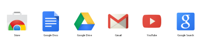
I quite like this new versions. Much better than their old one! I agree though, it's a shame they don't all have some similar theme... they do look all disjointed. Then again, I think it's the same for most companies out there who have smaller 'branches' in the business. Even google with their app icons are irritatingly different sizes, heights and widths... although they do have a strong style that does follow through them all: