Please don't get offended if I explain this in idiot proof terms, I don't want to offend, I just don't have any idea how much you know...
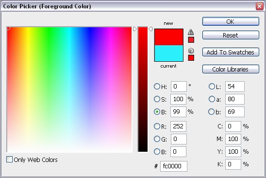
If you are using photoshop (safe guess really), when you are selecting colours, you have the colour picker (hex values like FFFFFF or 000000 etc there are millions of them)....
yes?
right if you have used the , then you might have a problem, the colours on this are really intended for web values (and they aren't guaranteed in that format, but that is something else), what you need to do is click on the colour libraries part, this will take you into the pantone menu. (pantones...obvs, not so many of them)
yes?
Learn about pantones, it will help you no end.
Now, you can use the colour picker and the colour library hand in hand to get the sort of colour you want, but it is better to use the pantone value as a rule.
If you have lots of colours, then it is best to focus on getting any block colour areas you can, using pantones as they are a printers friend.
The main reason you want to think in terms of pantones is they are the same in more or less every context, and you can get a pantone book
Like this, but hunt around, they can be way cheaper...
Then you can use the colour you want on screen, and check back and forth between the pantone book and the pantone value you have on screen, this is one of the problems, screens dont match print exactly (agreed everyone?), so having a hard copy reference can be a life saver.
A lot of this depends on the printer, but it is one of those things that is important to know.
Screen to print colour? Now that is always difficult, there are devices that are supposed to make them match, but they are £50+, best to try and get some idea of colour values through printing (accidents in some cases) and then work from there. Once you get to know how some of the pantone values in print, you will be alot more confident about colour choice.
Make more sense?


")