need help with personal logo

g3m1nn1

Junior Member
Hello everyone,
I am in need of some help and feedback.
i am trying to design a personal logo for myself. i am an engnieer of multimedia and wish to have a simple, clean and minimalistic personal logo.
I have tried to work with my initials JK but i just cant get them to work together. I am attaching some work in progress and was hoping if anyone can give me some ideas ( if you would like to ) and perhaps pointers which way to go.

What a symbol presents is the black are a Morse sign of J letter, and next to it is K in Morse.

thanks in advance

 

Attachments

  • jkkoncept.jpg
    jkkoncept.jpg
    37.1 KB · Views: 22
Hi, The bottom text on its own is o.k looking maybe increase the weight of JAN. do you need a picture with it?
 
Charles i changed it and am attaching the results, i included other types also.
HippyS: The graphic is divided into two columns, left is J initial in morse code and right is K ( my initials ).

I just cant figure out something to associate with what i do: multimedia ( sound, video etc. ) and not looking for film roll or cassette sign, you know.
 

Attachments

  • JK2.jpg
    JK2.jpg
    48 KB · Views: 15
you symbol seems like a sort of symbol for a music guy.. that green lines are like that audio bars from the radio.. you know what i mean?

the all type is good.. i like the clean look of it! you may use only for start the typo for a logo and in meanwhile you´ll find for sure some great idea to make the perfect logo :D

like i already read here in the forum, the worst client is ourselves :D really like that phrase :D
 
I like the idea, but all the symbols are marks confuse the **** out of me, in plain english what is it meant to say?
 
@mrp2049: symbols show the JK in Morse code.
@desigium: The music symbolism is not all bad I just wish to achieve more universal Multimedia concept. Hopefully something will come up. otherwise i will you Type-only logo until then.
 
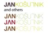
thats the close as i came on earthy grey, i also included one with all the dark colours.
 

Attachments

  • JKA.jpg
    JKA.jpg
    59.7 KB · Views: 5
maybe more brown and lighter. i like the second one and the last one.

nearly there though.

are you using illustrator to create it?
 
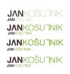
Yes, AI, i just saw the palette you posted and i also used some other so here it is.
 

Attachments

  • JKB.jpg
    JKB.jpg
    27.5 KB · Views: 4
  • jkc.jpg
    jkc.jpg
    37.6 KB · Views: 2
i think the brown from the top one with the green from the second one would be good result and use tiny bit less weight on the green word than used in first one.
 
considered your advice and with different sizes, i am attaching it.
 

Attachments

  • jkf.jpg
    jkf.jpg
    92 KB · Views: 8
first is maybe too thin in smaller version, i think.
So maybe second.

thx for all your feedback, Charles
 
Back
Top