You are using an out of date browser. It may not display this or other websites correctly.
You should upgrade or use an alternative browser.
You should upgrade or use an alternative browser.
Need help with a logo, please
- Thread starter waterwoman
- Start date


scotty
Ultimate Member
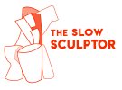
Hi. You are absolutely right, I should use my own piece as the logo. After reading the feedback, I will be choosing The Slow Sculptor. One commenter mentioned that he didn't think the font was that great for the Slow Sculptor logo. Do you have any suggestions for fonts? Thank you.
I don't think there's anything wrong with the one you have.
")
scotty
Ultimate Member
The 'the' is the lightest typeface for this font - Lemon/Milk. Which one did you use HankScorpio?
This is coming along and I love your choice of colour as it's the best colour because it's my favourite.......colour.
Your sculpture looks good and much more personal to you and so does your line drawing bit I'd personally try to keep all the lign weights the same to keep it unified and consistent but I'd also try adding a heavier outline around the outside (rounded corners) which will make it look stronger and also better at smaller sizes.
Paul Murray
Ultimate Member
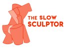
If this were a job I was working on, I'd maybe be looking to do something long these lines, basically taking a sculpture and abstracting it to create a unique mark. Sagmeister and co basically took the shape of the museum and used the different angles as a logomark. That shape can then be used with colour and fills to create a visual identity. The mark you currently have is a little too messy for me, it's not clear what it is, and it's not abstract enough (in the sense that it needs simplifying).
Personally, I really like this as a starting point, though I'd simplify it even more and use thicker lines. It's abstract, but has recognisable features. It literally puts a face to the name.

Personally, I really like this as a starting point, though I'd simplify it even more and use thicker lines. It's abstract, but has recognisable features. It literally puts a face to the name.
waterwoman
New Member
Thank you for your response. I appreciate your input. I agree with you and will work on it. Did you prefer Spirauskas over The Slow Sculptor?If this were a job I was working on, I'd maybe be looking to do something long these lines, basically taking a sculpture and abstracting it to create a unique mark. Sagmeister and co basically took the shape of the museum and used the different angles as a logomark. That shape can then be used with colour and fills to create a visual identity. The mark you currently have is a little too messy for me, it's not clear what it is, and it's not abstract enough (in the sense that it needs simplifying).
Personally, I really like this as a starting point, though I'd simplify it even more and use thicker lines. It's abstract, but has recognisable features. It literally puts a face to the name.
View attachment 6901
Paul Murray
Ultimate Member
Did you prefer Spirauskas over The Slow Sculptor?
I think I did, Spirauskas is so abstract to the English tongue that it could work just as a studio name. It sounds like a luxury furniture store to me. I think The Slow Sculptor sounds a little negative. Maybe there's another word you can use insead of 'slow'?