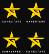
Need Help Making this design less "boring"

Evan Sweetin

New Member
So my client thinks that this EXTREMELY fitting logo concept is too boring to be the logo for his esports organization (professional gaming team). (I am also one of the designers on the team so this logo will represent me as well) The current (soon to be old) logo has parts that are taken from other designs and we can't have that obviously. The logo with the wings is the current design, and the two star concepts are my designs. The owner of the organization said that he thinks its boring and lacks "something". He is the type of owner who also wants a bear as the logo (something that is completely random and has no meaning to the brand) rather than this.
So how can I:
A) Make this design seem less "boring" and
B) convince him that this design, or idea is the far better way to go in terms of having a logo that goes with the organization?

Please reply quickly, I've been working on this project for 5 months and we've gotten nowhere.
 

Attachments

  • GoldLogoSquare.png
    GoldLogoSquare.png
    243.4 KB · Views: 22
  • Screen Shot 2016-09-09 at 12.48.09 AM.png
    Screen Shot 2016-09-09 at 12.48.09 AM.png
    33.4 KB · Views: 20
as a graphic icon I really like it. Boring? well… that's because you 're showing it in a fairly insipid colour on a white background! Try showing it on dynamic back grounds, bring it to life!
Have a look at this to give you an idea…. the logo on first sight looks a bit boring but when you see it implemented it looks a lot better….just a quick example…have a look through that site for more inspiration….good luck!
http://www.underconsideration.com/b...thletics_and_berliner_benson.php#.V9JmPen2zvM
 
That shade of black would be the new version of black that would go with the brand rather than pure black, which is what we are currently using.
 
It's 4 up cos there's 2 fonts! - obviously! :) ahhh…black isn't as boring as white! but still needs a bit more context/action?? I don't know
about the world of gaming, i'm too old…it's dominoes in the pub for me.
 
The brands colors are black/yellow. I didn't choose it because its boring. but because Im sure a nice neon color probably just wouldn't look right. lol. The point is simply the star, the fonts where just me testing something. but a combo of one of those fonts/star designs is something I want to propose. Sorry for the confusion. Im debating that I should just leave it the way it is and create some mock images with that logo.
 
Back
Top