You are using an out of date browser. It may not display this or other websites correctly.
You should upgrade or use an alternative browser.
You should upgrade or use an alternative browser.
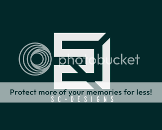
my personal logo
- Thread starter stevey17
- Start date
BenJonesDesign
Active Member
good start Steve. To be honest I don't tend to think it always matters that your name is clearly represented in the symbol of a logo, a symbol is a recognisable element and I would say that the symbol you have produced is pretty good. A few things that I would recommend changing how ever are 1 the font, doesn't really tie in with the shapes of the symbol, and 2 personally I think it would look better if the edges of the symbol and the wording were aligned so the text isn't "hanging over".
Lastly, perhaps you could try a few different colours. The green works but it might not be the best, just think about the logo long term, how it would fit in with the various medias it would be displayed in.
Lastly, perhaps you could try a few different colours. The green works but it might not be the best, just think about the logo long term, how it would fit in with the various medias it would be displayed in.
WEBIAN
Senior Member
BenJonesDesign said:I think it would look better if the edges of the symbol and the wording were aligned QUOTE]
Yes, it'll look more stable.
But I like the font you're using for SC DESIGN.
retrosketch
Junior Member
I agree with webian! like the logo and font, but align the text with edges of logo
Swati Begwani
Junior Member
I really appreciate your hard work, good start, I really like it.
