You are using an out of date browser. It may not display this or other websites correctly.
You should upgrade or use an alternative browser.
You should upgrade or use an alternative browser.
More logo feedback
- Thread starter Wrighty
- Start date


graphicrabbitstudios
Member
I personally prefer the white background. The pink is much more vibrant.
A little unsure about the length of the horizontal bar on the t? Also the 'Cleaning Services' looks a different pantone colour to the 'neat' type.
Apart from that i like")
Sam
A little unsure about the length of the horizontal bar on the t? Also the 'Cleaning Services' looks a different pantone colour to the 'neat' type.
Apart from that i like
Sam
jamieleung
Member
maybe try a lighter shade of pink on the blue background? or apply the lighter shade to both colour options. overall really nice design
dot design
Member
I like it overall, it's clean and simple, prefer it on the white.
But not sure why you're using an asterisk symbol though?
But not sure why you're using an asterisk symbol though?
dot design
Member
Wrighty said:Thanks again for the feedback people. Dot Design, the symbol is not meant to be an asterisk, it's meant to represent a floral symbol, to highlight a fresh and clean environment
oops sorry Wrighty, there's always one (me)
tbwcf
Active Member
I like the logo Wrighty but agree that magenta doesn't work on cyan, the white version is cool but can also understand the astrix point too, maybe even rotating it a bit would help? don't think it's too big an issue either way but magenta on cyan is a defo no, no.
I live in Camberley too, might see the cleaning company around or maybe you down the carps sometime.
Andy
I live in Camberley too, might see the cleaning company around or maybe you down the carps sometime.
Andy
Cheers for the feedback Andy. I am not going to use the magenta on the cyan background, as the logo would normally appear on white. If it has to go on blue, then the logo would be all white.
I live up by the maultway in Camberley, maybe see you about sometime. Nice site too mate.
I live up by the maultway in Camberley, maybe see you about sometime. Nice site too mate.
Hi Wrighty,
I quite like the logo, and agree with Andy about rotating the symbol, this might help it appear less asterix like? As for the name, I guess you don't have control over this, but a shorter second line would allow the text to go bigger, as think the word cleaning is a bit too small at the moment, wonder if 'Neat Cleaning Co.' would be better, so 'Cleaning Co.' could be a fair bit larger then, and maybe easier to see it's cleaning as a result?
Hope that helps,
Greg
EDIT: Maybe something like this?
Cheers for the extra feedback guys. I thought over the comment of the sparkle and thought it was cheesey, but think if I add it, in a nice way, it might look ok, as the floral symbol has not gone down too well.
Greg: Thanks for the thoughts mate, but I can't change the name, as they have registered cleaning services, and that's the name they gave me, but good idea!
I have made a few tweaks, to the font too, as the balance of the 't' was driving me mad. Let me know your thoughts. Cheers.
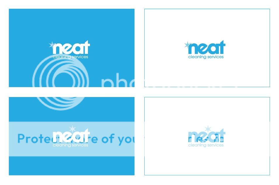
Greg: Thanks for the thoughts mate, but I can't change the name, as they have registered cleaning services, and that's the name they gave me, but good idea!
I have made a few tweaks, to the font too, as the balance of the 't' was driving me mad. Let me know your thoughts. Cheers.