You are using an out of date browser. It may not display this or other websites correctly.
You should upgrade or use an alternative browser.
You should upgrade or use an alternative browser.
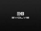
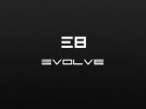
mark / logo -
- Thread starter ch3tzy
- Start date


ch3tzy
Senior Member
^ ARGHHH! lol.
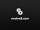
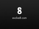
Yeah the last one..is getting scrapped!
The reason why I liked the first one is because of the way they feel connected. evolve = playing on the word design moving forward changing in time etc...
agree 2nd one need more work..but could it be the fact that we know as designers how the logo is created that's whey it looks like just two letters on top?
ill keep at it, thanks for the input guys.
")