Malcolm Blezip
New Member
Sorry for my english, not my first language.
—
Hey guys.
Im currently working on a new logo for a financial banking company based in several countries.
The customer has a pretty clear vision about how the logo should be and without mention too many secrets because it's still under progress, I could say he wants it to look like some sort of windmill. Or at least be reminded of it.
I've been doing probably over 50 different types of mill logo's but none of them feels like the right one.
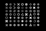
After all of theese logos, I've kind of felt like maybe we have to trie something else.
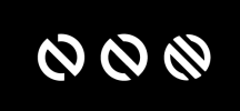
The first letter of the company is N, so right now Im trying to find some sort of way to bend it into a more geometrical shape, and one more time make it remind of a a spinning mill or something. But this options looks way too hard and reminds me of a stop-sign or some kind of superhero icon.

This is my latest one, which I think came out pretty decent but I still want to make it more unique and interesting like the idea of reshape the capital N into a mill.
I've been doing a lot of research trying to find some interesting things but right now Im totally stuck. If you guys have any input, feedback or things that could get me inspired your'e more than welcome to tell me!
—
Hey guys.
Im currently working on a new logo for a financial banking company based in several countries.
The customer has a pretty clear vision about how the logo should be and without mention too many secrets because it's still under progress, I could say he wants it to look like some sort of windmill. Or at least be reminded of it.
I've been doing probably over 50 different types of mill logo's but none of them feels like the right one.

After all of theese logos, I've kind of felt like maybe we have to trie something else.

The first letter of the company is N, so right now Im trying to find some sort of way to bend it into a more geometrical shape, and one more time make it remind of a a spinning mill or something. But this options looks way too hard and reminds me of a stop-sign or some kind of superhero icon.

This is my latest one, which I think came out pretty decent but I still want to make it more unique and interesting like the idea of reshape the capital N into a mill.
I've been doing a lot of research trying to find some interesting things but right now Im totally stuck. If you guys have any input, feedback or things that could get me inspired your'e more than welcome to tell me!