You are using an out of date browser. It may not display this or other websites correctly.
You should upgrade or use an alternative browser.
You should upgrade or use an alternative browser.
Logo Suggestions wanted
- Thread starter thingstodo
- Start date
Paul Murray
Ultimate Member
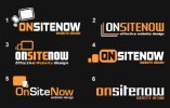
I prefer 3, I like the typography, though I don't like the tagline beneath it. I think the mark needs to move down inline with it though, either before or possible after. If you put it after, I'd flip it so that the devices go from large to small (even though this is the opposite order you'd design a responsive site in).
Number 4 reminds me of YouTube.
Number 4 reminds me of YouTube.
Not a bad starting point. I think it's easiest to grasp that the shapes represent devices in #1 but I don't really care for the way they're arranged in any of the examples (I haven't really thought it through but I'm sure there's a nice, satisfying way of arranging them - and I do like it as a basic idea: I'd probably start with them inside one another [probably aligned to a common corner] and maybe experiment with using one or other (or all) of them to create my letter 'O'). Typographically, everything here smacks of free fonts, which - although perhaps only the kind of thing that would catch a designer's eye - I see as producing a 'low-end' effect; a lot of them have a slightly clumsy, unfinished look to them.
thingstodo
Member
Paul Murray
Ultimate Member
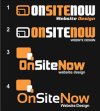
I prefer number 1.
I think 2 rather than one, but only because of the strapline font. I'm also still not crazy about the main font character set but, if you're liking it, I'd at least redraw the lowercase 'n' to get rid of the vertical bar on the left (*vocabulary failure*) - I think it would look better (and sit better with the other characters in use) as a single shape with a sharp corner top-left and a curve top-right.

