Logo help/opinions

Sutchy81

Junior Member
Hello Everyone,

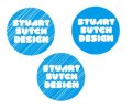
I have been working on my new website of late. The one thing I always struggle with is logo design and I sort of feel that it is very important for my site to make it right. I have attached a few variations of what i am working on. If anyone can give any opinions or constructive feedback then that would be brilliant thanks :)
 

Attachments

  • SSDesign Logo.jpg
    SSDesign Logo.jpg
    19.9 KB · Views: 47
Hi Sutchy,

To be honest personally I would start from scratch and try several other ideas. Your current logos seem quite constrained and to me don't really convey the idea of professional design. I would come away from the circle idea and try working around the font. If you can't find a design that suits the font then the font is the wrong choice too, try using a few others.

The problem I think is that by the sounds of it the website has come first and the logo last. Wrong way round. The logo should always come after the initial concept of the business. Everything you design for the business should always have the logo incorporated in some way to keep all aspects recognizable as being your company.

If you have already designed the site then stop, go back to the drawing board and concentrate on your logo. Once you have a logo that suits not just the idea of the company but you as a person, then use that logo to design the website (colour themes layout etc)
 
I quite like it actually Sutchy. I agree that the choice of font renders it slightly illegible, but I don't see anything wrong with the blue circle. itsnicethat.com used to have a similar logo, and the circle effectively is used in some classic pieces of design, as in Jan Tschichold's work - so it has heritage.

How does the logo stand now?
 
I like the colour, I think you should take the stroke down on the type and post a high res version of the the plain (non struck) logo, that could look good.
 
Back
Top