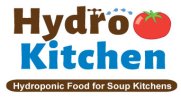
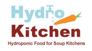
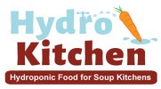
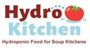
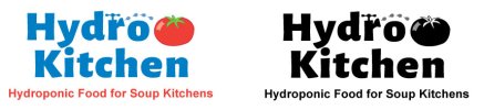
Hello, Everyone. Although I created this logo myself, I am not a graphic designer but have worked in graphic production for many years. I want to leave advertising and start a homestead as a sculptor and farmer. Most of my food will be donated to soup kitchens for the homeless and will be grown hydroponically. There are subtle differences between these four. Please let me know what you think. Thank you all kindly in advance for your help, it is sincerely appreciated.
You are using an out of date browser. It may not display this or other websites correctly.
You should upgrade or use an alternative browser.
You should upgrade or use an alternative browser.
Logo for Hydroponic food for the Homeless needs critique, please
- Thread starter TaraM
- Start date


Paul Murray
Ultimate Member
I think the idea needs simplifying a lot, you've got 4 variations of a single idea that isn't quite working. Ideally you'd be working in a single colour – the veg is borderline clip art and wouldn't work if you could only print in black for example. The tagline is also too small in relation to the main type and would get lost at smaller scales. I'd also refrain from boxing it off like versions 1 and 3.
I think there's probably some clever way you can combine the idea of water and food without being so literal. I feel it should be rustic, not looking out of place on a board in a field for example.
I think there's probably some clever way you can combine the idea of water and food without being so literal. I feel it should be rustic, not looking out of place on a board in a field for example.
Thank you. I made it literal as Americans are lazy and infested with ADD and only give a few seconds for interpretation. Hope you don't mind an American barging in on your forums but the forums on my home turf are cruel and not helpful. American comments like 'that sucks' don't tell me how to fix it. I would love a less literal idea and will work on that. If anyone has any ideas, I'm open to them. Meanwhile, here is some improvement. I tried the tagline on two lines and larger but it started to compete with the name.
p.s. My last name is Murray too, Scottish descent.
p.s. My last name is Murray too, Scottish descent.
Attachments
Chrisd_#81
New Member
Couldn't agree with Paul more. When designing in today world always consider digital first which can be flat colours and simplistic design, just worth looking into. Consider the tiny icon that will appear in the twitter feed and how the colours will work for accessibility online. I know that seems way off but safeguarding your brand identity now will future proof it later and cause less headaches. Also you can learn a lot by looking at other charities or similar companies that are doing design for good especially with their bold and simple branding. Shelter is a great example when the overall mission & vision is incorporated into the word marque. Social Bite in the UK is another. The more advance work is FedEx with the hidden arrow which delights the user and again is simplitic but a tough idea to start with. Hopefully it helps but good ideas so far and good luck. Chris